Sunday, September 30, 2018

Attn Attn renovates Lenox Hill Residence for graphic designer

New York studio Attn Attn Architecture and Design has gutted an apartment in the city, and used light-toned marble against dark colours for a "classic but unique aesthetic".

The 800-square-foot residence in the Lenox Hill area of Manhattan's Upper East Side was overhauled for a graphic designer, who wanted maximum impact on a limited budget.

Lenox Hill Residence Renovation by Attn Attn

Attn Attn "started with ambiguous functionality, quirky original details, and deteriorating DIY finishes installed by a previous owner", so ripped everything out and began again from scratch.

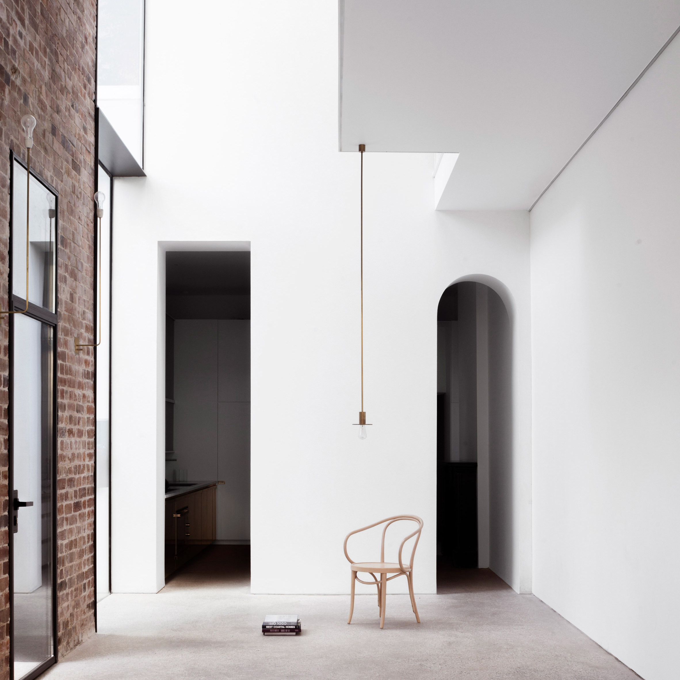
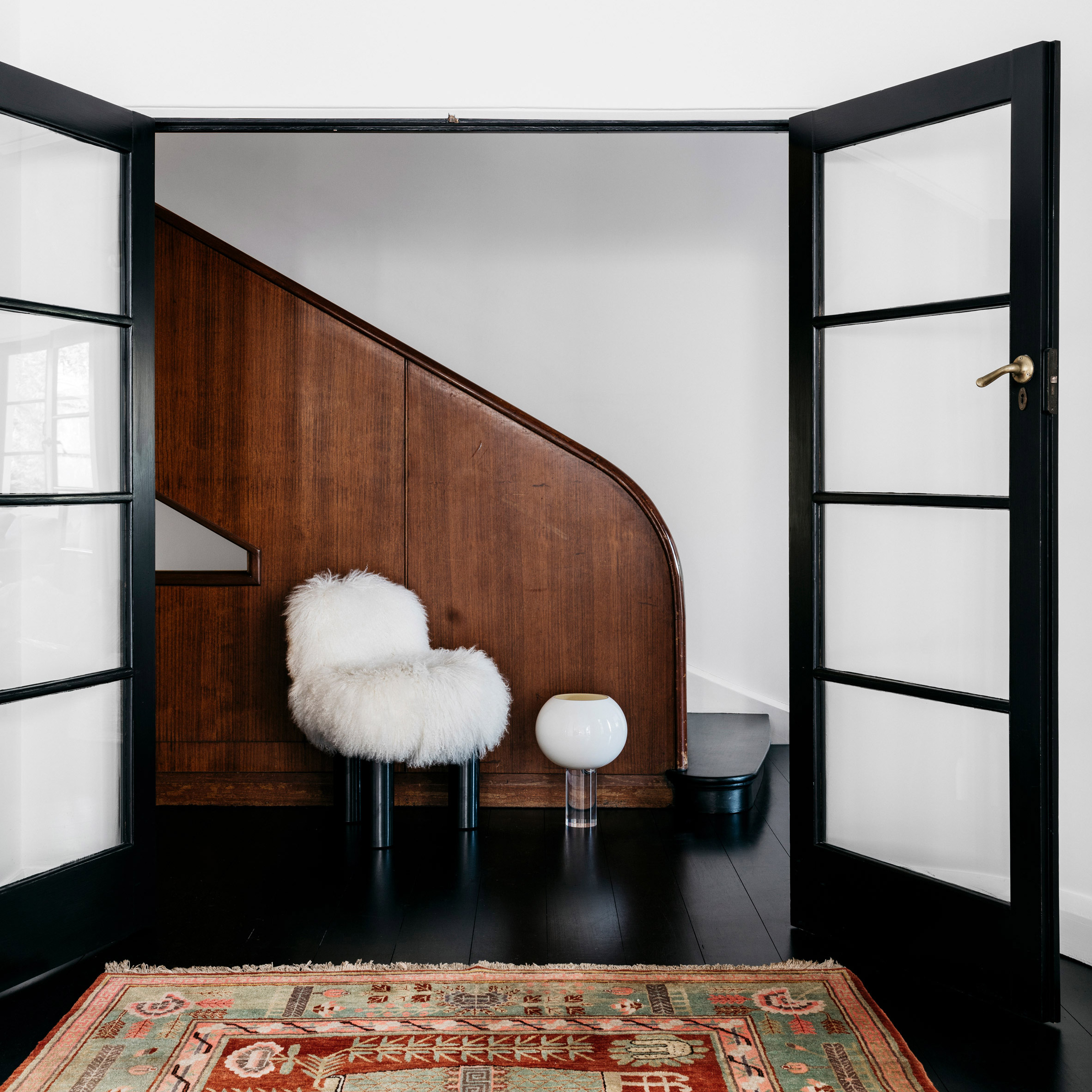
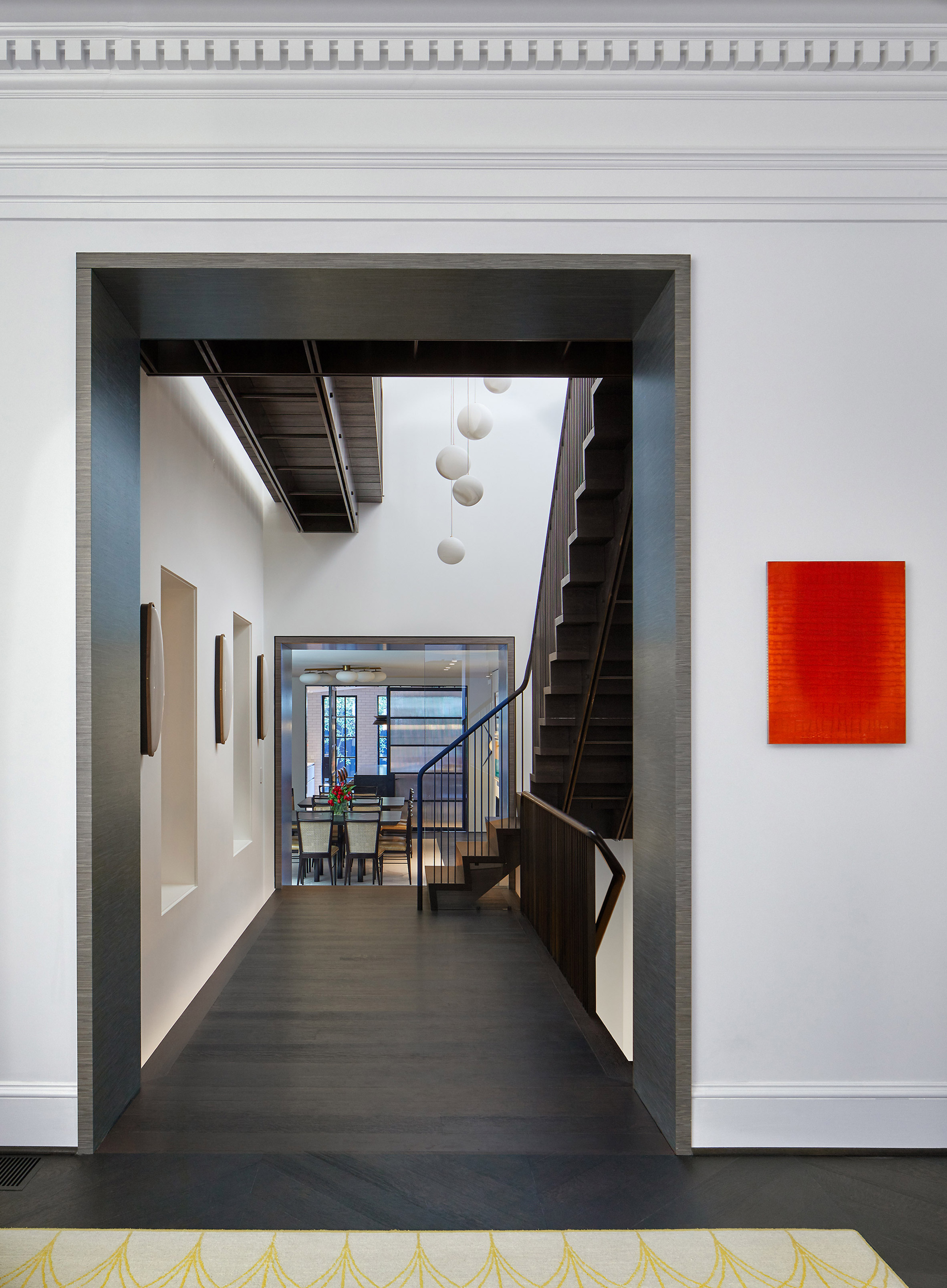
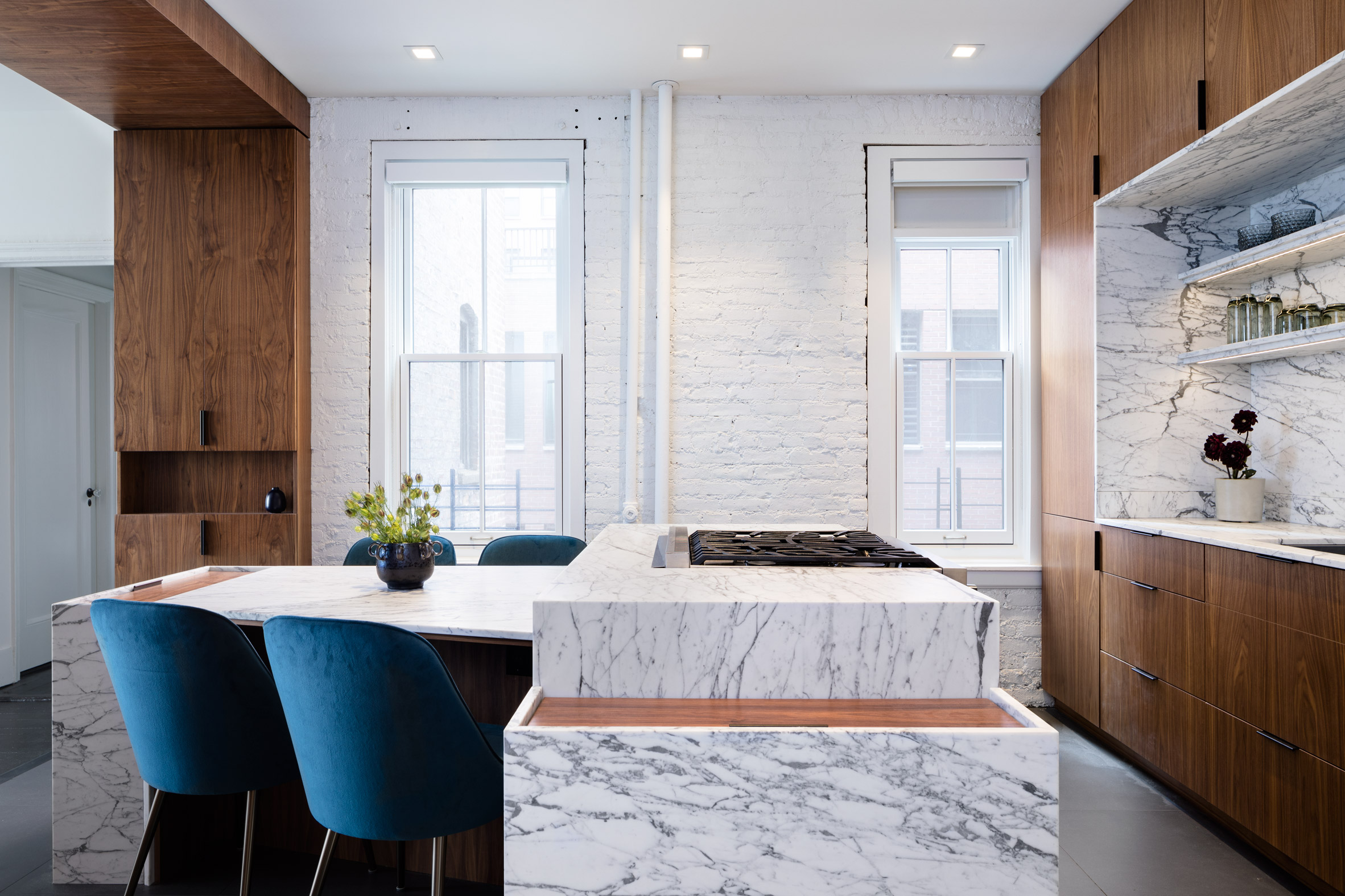
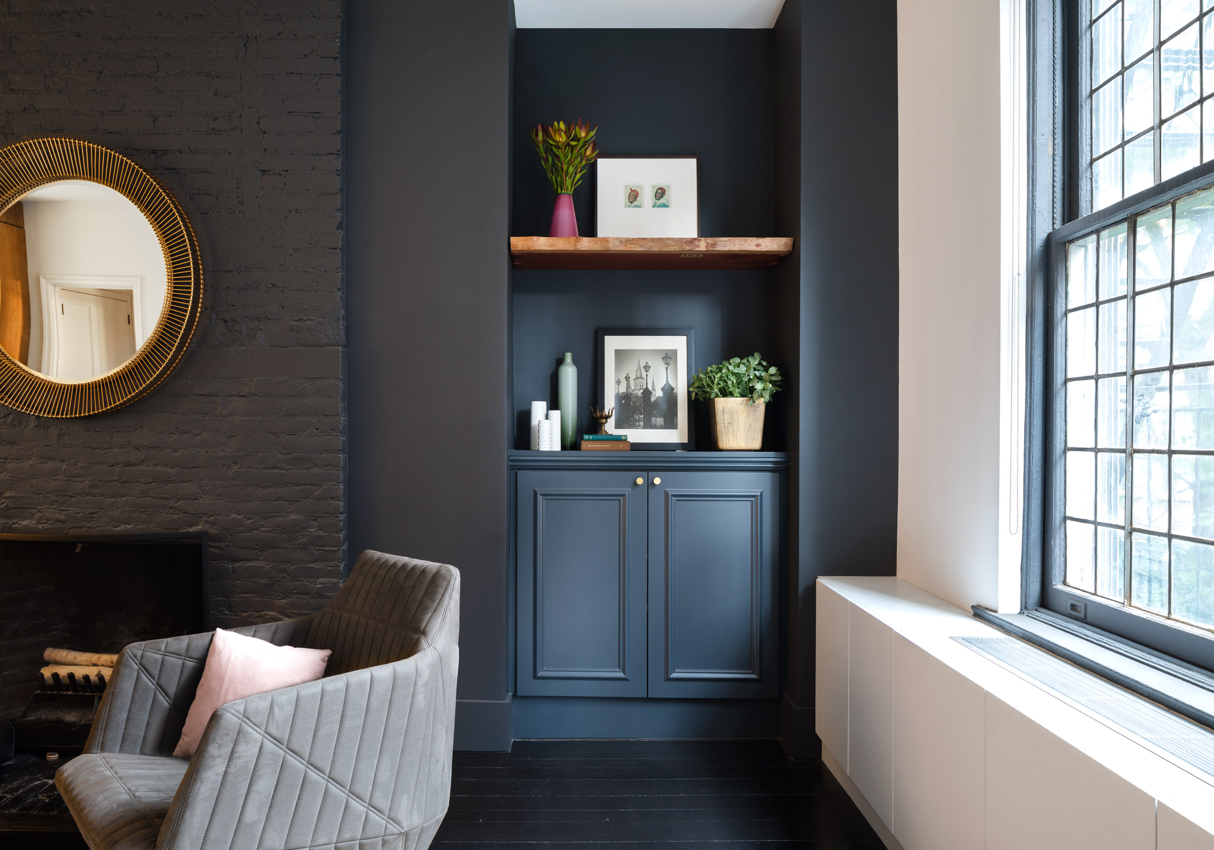
The spaces in the pre-war apartment were reorganised, and a statement threshold was instead used to separate functions in the living space.

Lenox Hill Residence Renovation by Attn Attn

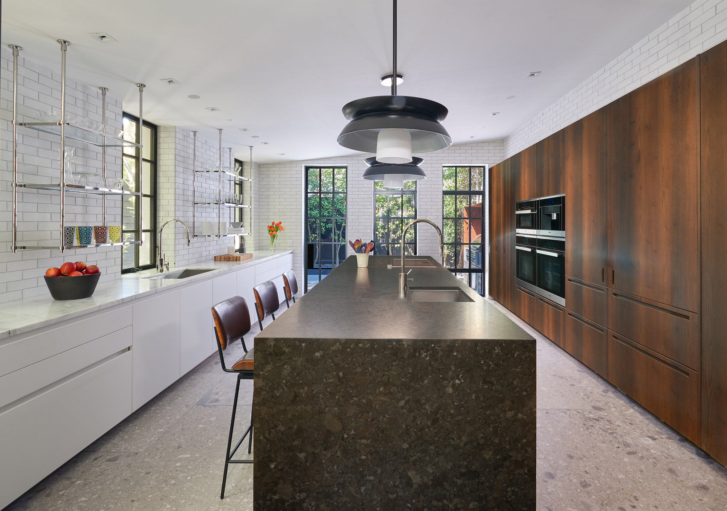
This dark wood element forms an arch between the kitchen and the lounge, and also integrates storage cupboards.

The same wood is used for cabinetry in the cooking area, where units surround a recessed counter and shelves of veiny marble.

Lenox Hill Residence Renovation by Attn Attn

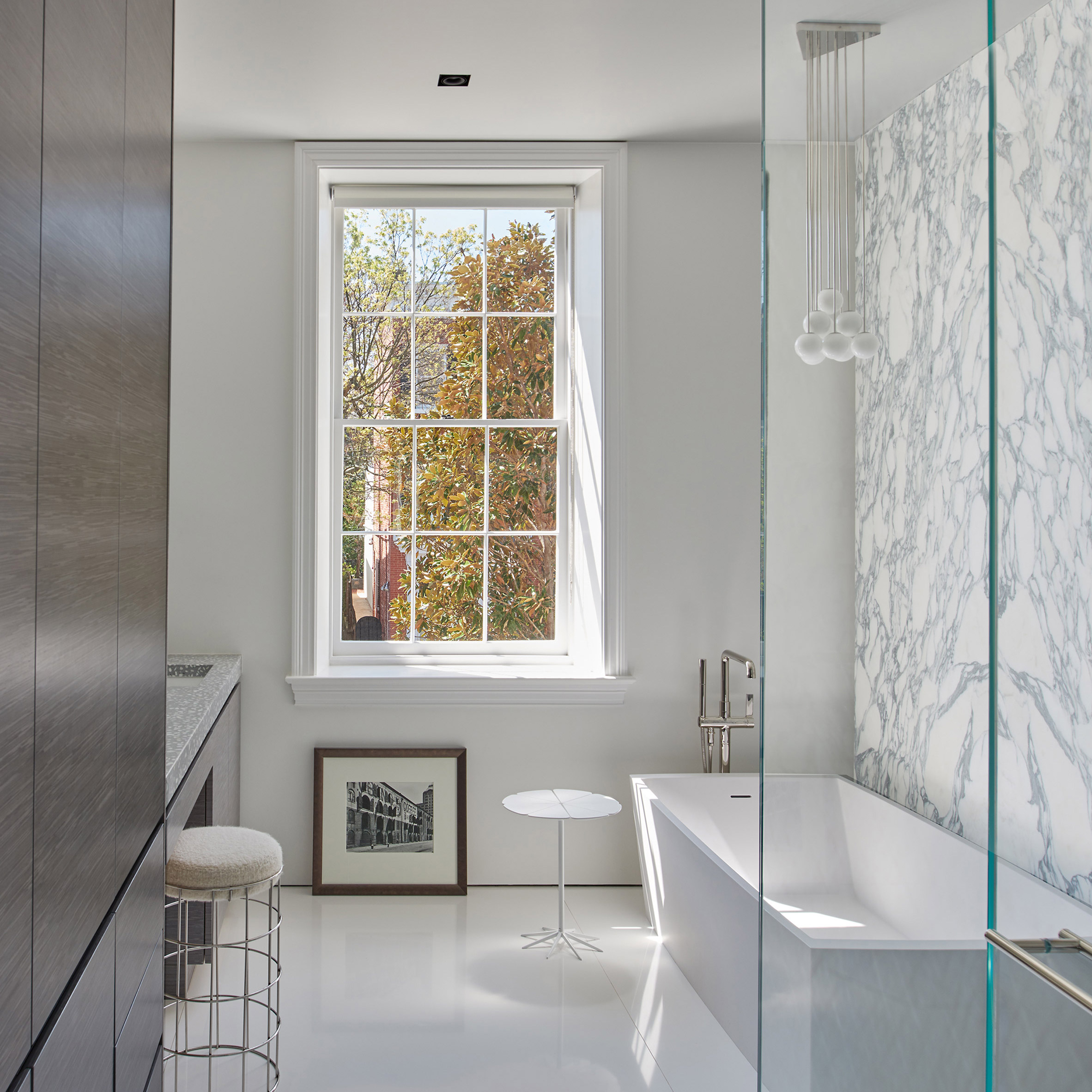
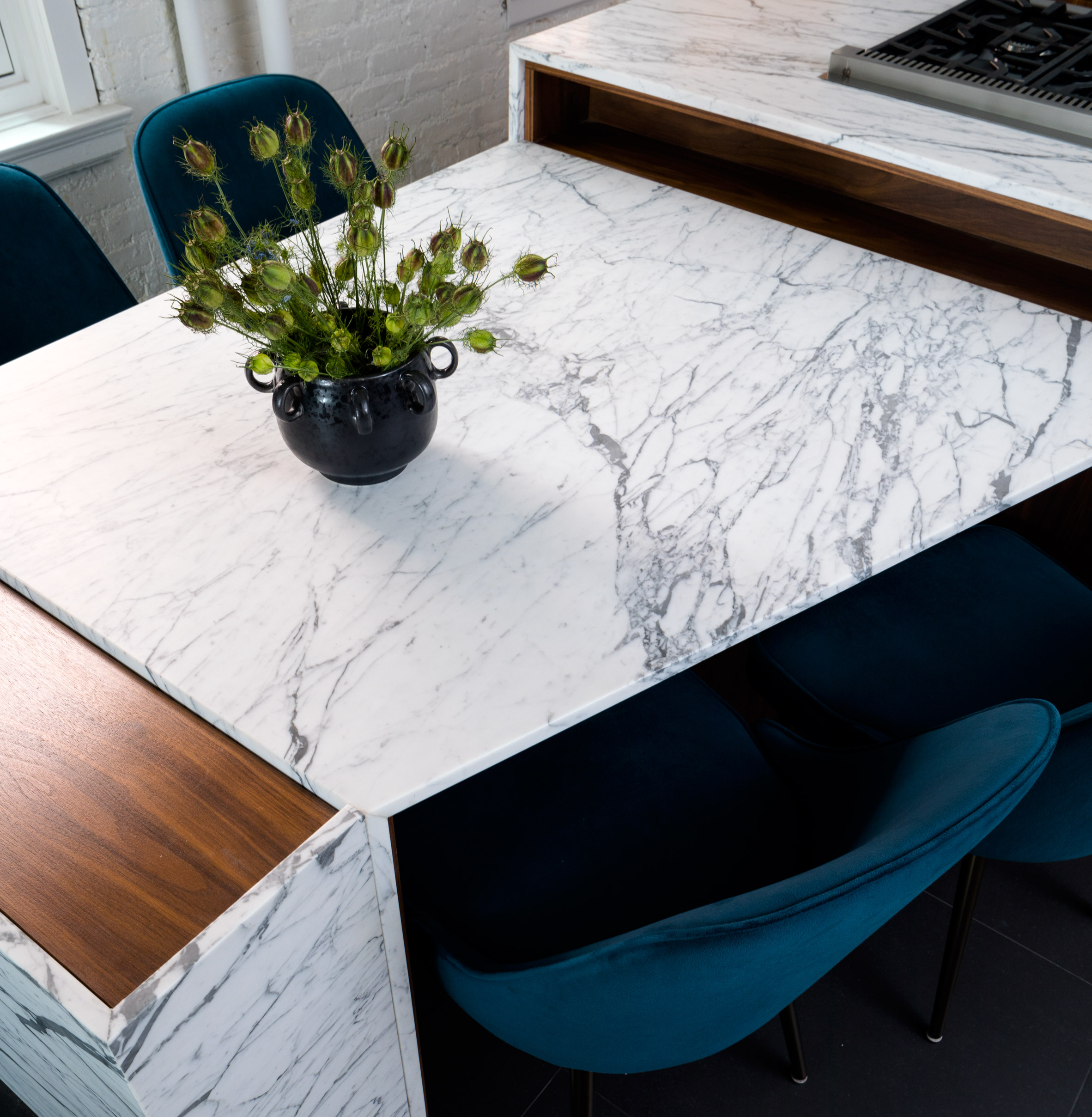
This stone provides an accent material throughout the apartment. It forms a kitchen island, from which a dining table extends at an angle, and surrounds the tub and shower from floor to ceiling in the bathroom.

"In reference to the client's graphic designer sensibilities and appetite for bold patterning," said Attn Attn, "natural stones and woods with contrasting lines and textures were chosen, and carefully manipulated to delineate spaces while simultaneously tying together appropriate functionality."

Lenox Hill Residence Renovation by Attn Attn

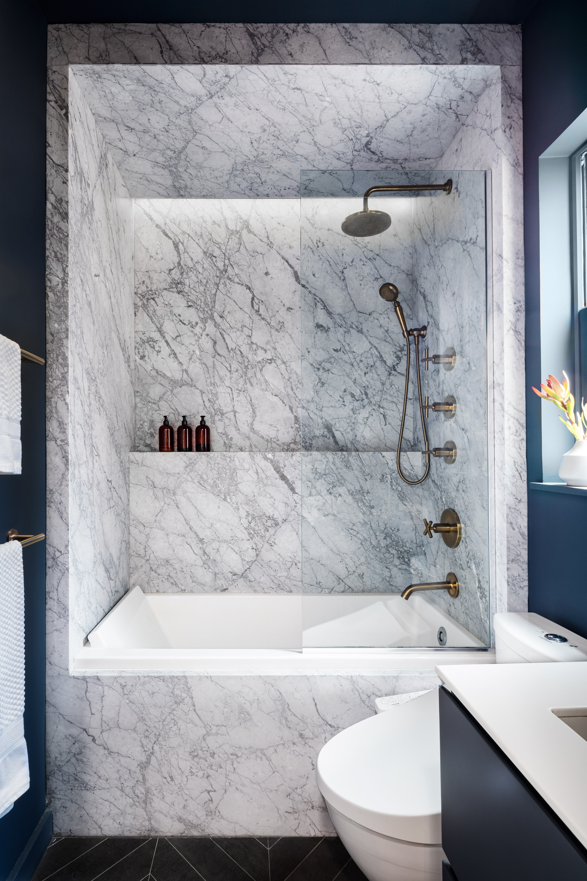
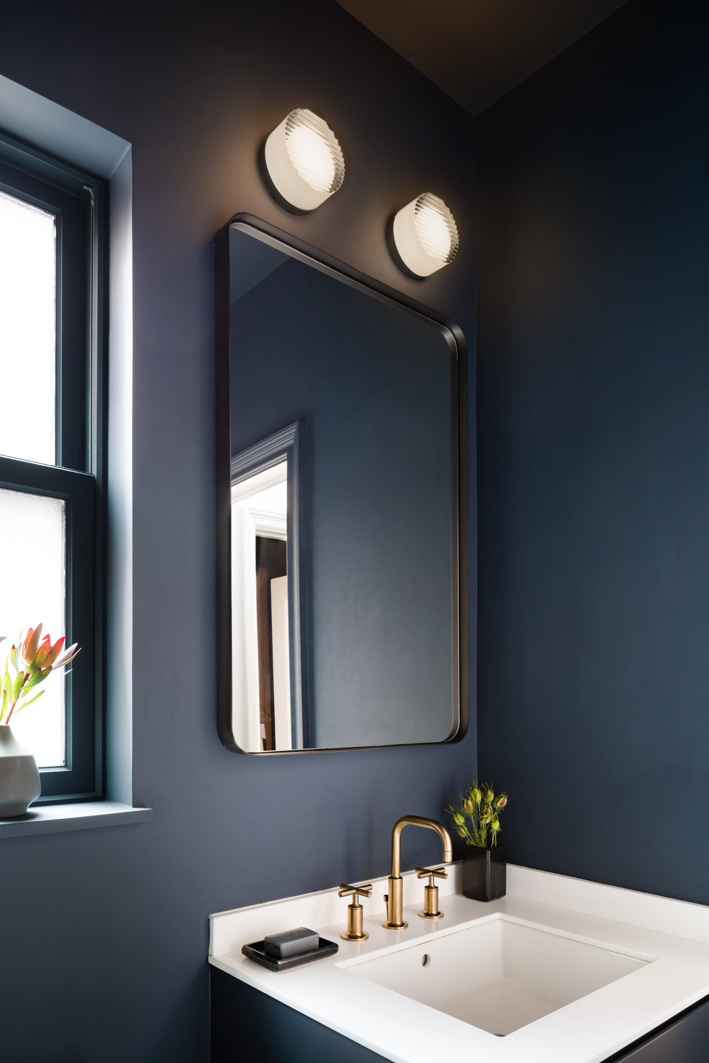
Other surfaces in the bathroom and living area are painted rich blue, and the flooring is black – both to highlight the light shades of the marble.

Walls containing windows are coloured white, while the navy paintwork is matched with the dining chair upholstery.

Lenox Hill Residence Renovation by Attn Attn

Overall, the Lenox Hill Residence comprises "simple geometries with just a touch of unexpectedness, for a classic but unique aesthetic", according to Attn Attn director Egbert Miles Chu.

New York City's notoriously small apartments often require creative solutions to maximise space. Others that have rearranged layouts to make the most of floor area and natural light include BoND, which renovated a "dark, divided" home in Chelsea, and MKCA, which used custom cabinetry to transform a West Village apartment.

The post Attn Attn renovates Lenox Hill Residence for graphic designer appeared first on Dezeen.

Explore fashion boutiques with impressive interiors via our Pinterest board

We've created a Pinterest board showcasing new fashion boutiques with impressive designs, including John Pawson's limestone and cherrywood interiors for Jil Sander and Celine's Miami flagship store featuring sky-blue marbleFollow Dezeen on Pinterest ›

The post Explore fashion boutiques with impressive interiors via our Pinterest board appeared first on Dezeen.

Ocean-themed restaurant by Alexander & Co and Tribe Studio opens on rooftop of Dubai Opera

A carpet designed to look like the ocean and an octopus-inspired artwork feature inside Sean Connolly at Dubai Opera, a restaurant atop Dubai's opera house, designed by Sydney studios Alexander & Co and Tribe Studio.

The ocean-themed restaurant and bar is located on the rooftop of Dubai Opera – a glass-wrapped performing arts centre designed to resemble a local dhow boat with its swooping roof.

Alexander & Co create an ocean-themed rooftop restaurant in Dubai

Taking advantage of this, the 350-person restaurant features an external courtyard and sky garden, which offers diners impressive views of the city skyline, including the Burj Khalifa.

This garden is used to grow produce for a kitchen run by chef Sean Connolly, who is known for his oceanic Australian- and New Zealand-influenced cuisine.

Alexander & Co create an ocean-themed rooftop restaurant in Dubai

His involvement provided the inspiration behind the restaurant's oceanic design, which Alexander & Co describes as an "underwater modernist salon".

"The bistro explores the colours and tones of the sea, oyster, sea cliff and coastal escarpment," explained the Sydney-based design interiors studio, which completed the project in partnership with architecture office Tribe Studio.

Alexander & Co create an ocean-themed rooftop restaurant in Dubai

Although largely open-plan, the venue is carved up into various different areas defined by changes in materials and finishes. Spaces include the Raw and Fire bars, a brasserie, a main bar, a private dining room, a chef's table and an external bar.

"The project was very ambitious and quite large," said Alexander & Co. "The design DNA developed from what was initially a coarse-grained Tasman inspiration – rugged, worn and sun bleached."

"However realities of the many Dubai Opera stakeholders and their own ambitions shaped the restaurant to become more refined, and a bit more delicate."

Alexander & Co create an ocean-themed rooftop restaurant in Dubai

The team were influenced by various 20th century buildings with swopping curved lines, such as the wing-shaped concrete roof of New York's TWA Terminal at JFK airport by Eero Saarinen, and the shell geometries of the Sydney Opera House.

"Each design element within the venue explores ideas of the sea, from the oyster with its combination of smooth sensual surfaces and textured outer surfaces, to the oceanic tones and colours of corals and pearlescent hues," they explained.

For example, the designers used a combination of matt and gloss tiles on the restaurant's vaulted ceiling to evoke the sheen of oyster shells, while the grey marble banquettes with pink leather upholstery in the central Pearl Bar are inspired by the delicate contrasts of ocean corals and sea creatures.

Alexander & Co create an ocean-themed rooftop restaurant in Dubai

The Pearl Bar, which functions as a central cocktail bar, is constructed from grey leather, walnut timber and yellow marble, while the decor of the raw and fire bars is influenced by the outer edges of blackened seashells.

Extreme knitter Jacqui Fink created a custom six-metre-high Merino Wool hanging artwork that references the tentacles of sea creatures. Meanwhile local Sydney artist Tracey Deep, known for her floral installations using found and native flora, created three hanging sculptures based on the ocean.

Alexander & Co create an ocean-themed rooftop restaurant in Dubai

A dappled blue woollen carpet that recalls ocean waters was custom designed by Alexander & Co, while classic Serge Mouille lighting was custom made in curving white enamel steel and brass finishes to tie in with the references to the curvaceous 20th century buildings.

The spaces are furnished with various pieces of 20th century furniture in green, grey, blue and white tones combined with natural walnut timbers.

Alexander & Co create an ocean-themed rooftop restaurant in Dubai

"Central to our innovation at Sean Connolly at Dubai opera was an ambition to arrange inexpensive materials in a way that would give them architectural value and a historical reverence," concluded the team.

"Noting that the local trends within Dubai are recognised for a design tendency to overuse expensive materials to the point of cheapening them, our goal was to utilise where ever possible inexpensive or mass produced materials in a very focused and detailed way so as to almost through alchemy, turn them into something magically beautiful."

Alexander & Co create an ocean-themed rooftop restaurant in Dubai

Alexander & Co is shortlisted for emerging interior designer of the year in the inaugural Dezeen Awards. Other projects by the studio include a renovation of a waterfront holiday home in Sydney featuring a monochrome colour palette.

Tribe Studio's other recent projects include a house extension featuring a "brick sunburst".

The post Ocean-themed restaurant by Alexander & Co and Tribe Studio opens on rooftop of Dubai Opera appeared first on Dezeen.

Saturday, September 29, 2018

Eight Australian homes that show the best interior design down under

Australia is leading the way when it comes to imaginative interior design for the home. Interiors reporter Natasha Levy reveals eight of the best recent examples, from a pared-back home in Tasmania to a pink-tinted apartment in Melbourne.


Dezeen roundups: Aussie homes

Footscray apartment, Melbourne, by BoardGrove Architects

BoardGrove Architects made this apartment look similar to a gallery by tucking away appliances and creating sculpture-like features, like an arched alcove that contains the kitchen cooker.

A colour palette of baby pink and soft grey help soften the concrete floors and walls.

Find out more about Footscray apartment ›


Dezeen roundups:

Italianate House, Sydney, by Renato D'Ettore Architects

Renato D'Ettore introduced brick surfaces throughout the pared-back interiors of this Sydney dwelling to emulate the worn patina of traditional Tuscan or Sicilian villas.

A handful of arched openings were also created to mimic the building's dramatic vaulted roof.

Find out more about Italianate House ›


Dezeen roundups:

Curatorial House, Sydney, by Arent & Pyke

A monochromatic colour scheme helped Arent & Pyke visually unite this 1930s Sydney home with its 1980s extension.

The studio hoped that the simple white walls and black timber floorboards would allow the client's unique array of furniture and art pieces to "speak volumes".

Find out more about Curatorial House ›


Dezeen roundups:

Suburban Canny, Sydney, by Tribe Studio

Quirky decor details add interest to the bright and spacious interiors of this brick-clad Sydney home.

The living area – where surfaces are largely covered by floor-to-ceiling grey cabinetry – features a marble-topped dining table, a ceiling lamp that doubles up as a planter and an L-shaped sofa crafted from three different materials.

Find out more about Suburban Canny ›


Dezeen roundups:

Sunnybanks House, Tasmania, by Core Collective

Core Collective combined white-painted walls with concrete floors and timber joinery inside this seaside home to create a neutral backdrop for the client's extensive collection of art and literature.

Touches of warmth are offered by statement pieces of furniture, like the tan-leather armchair which sits in a corner of the kitchen.

Find out more about Sunnybanks House ›


Dezeen roundups:

Highbury Grove, Melbourne, by Ritz & Ghougassian

The surfaces of this Melbourne home are lined with simple concrete blocks, which contrast against tactile eucalyptus cabinetry and velvet seating.

Sheer white curtains can be drawn back to reveal courtyard gardens populated with native plants like Australian tree ferns.

Find out more about Highbury Grove ›


Dezeen roundups:

St Vincents Place Residence, Melbourne, by B.E. Architecture

Splashes of colour and vintage furnishings sourced from across the globe helped B.E. Architecture avoid creating a starkly minimalist family home.

Here, in one of the bedrooms, a jade green wall panel has been unusually paired with dusky brown carpeting.

Find out more about St Vincents Place Residence ›


Dezeen roundups:

Bourne Road Residence, Melbourne, by Studio Four

Studio Four fused indoors and outdoors by fronting areas of this Melbourne dwelling with expanses of glazing – the bedroom now boasts views of leafy green trees.

The calming, all-white colour-scheme matches the building's pale facade, which the studio likens to a blank canvas.

Find out more about the Bourne Road Residence ›

The post Eight Australian homes that show the best interior design down under appeared first on Dezeen.

Friday, September 28, 2018

AAU Anastas adds stone vaulted gift shop to Crusaders monastery in Jerusalem

Palestinian-based studio AAU Anastas has designed a flat stone-vaulted extension to a 12th century monastery built by the Crusaders in Jerusalem, to house a gift shop.

AAU Anastas designed the gift shop to be a contemporary structure that respected the historical context of the St Mary of the Resurrection Abbey in Abu Ghosh – one of Jerusalem's most significant examples of witness of Crusader architecture.

St Mary of the Resurrection Abbey in Abu Ghosh by AAU Anastas

The Crusaders in Palestine were known for using a combination of different architectural elements that they brought from abroad and local elements.

Working with local stone masons, the studio adapted existing construction principles using novel design and new fabrication methods.

St Mary of the Resurrection Abbey in Abu Ghosh by AAU Anastas

Functioning as an extension to the existing gift shop, the structure connects with the monastery building on one facade.

Its grid-like ceiling is composed of 169 interlocking wedge-shaped stones that rest on massive stone columns. The system for interweaving the stones is inspired by the invention of French engineer Joseph Abeille (1673-1756), who patented a special system that allowed the building of flat vaults in 1699.

St Mary of the Resurrection Abbey in Abu Ghosh by AAU Anastas

"The new shop was conceived as a stone structure," said AAU Anastas.

"Just like most of the architecture of the monastery – including the church's crypt – the soundness of the structure relies on a delicate work of stereotomy."

St Mary of the Resurrection Abbey in Abu Ghosh by AAU Anastas

"The techniques used for the construction rely on novel design and simulation techniques of the structure's structural behavior, as well as on fabrication and mounting methods allowing for the assembly of precise topological interlocking," continued the studio.

The studio said that the woven stones are the first reinforced flat stone vault of such a scale.

St Mary of the Resurrection Abbey in Abu Ghosh by AAU Anastas

The new shop's square plan is organised around a sequence of columns that line the structure's three facades. Inside, the massive stone columns support display shelving that span across the shop's windows.

AAU Anastas are known for creating experimental stone structures. Previously the firm has made a latticed canopy in Jericho made from three hundred individually cut and mutually supporting stone pieces, and a stone tower made from curvy stone blocks cut by robots.

The post AAU Anastas adds stone vaulted gift shop to Crusaders monastery in Jerusalem appeared first on Dezeen.

Thursday, September 27, 2018

Fashion sits alongside found objects at the Forte Forte boutique in Milan

Art director Robert Vattilana used expanses of pale marble, gauzy curtains and an array of curious ornaments to create a "dreamy" atmosphere inside fashion boutique Forte Forte, in Milan.

Forte Forte store by Robert Vattilana

The store is situated in the historic Brera district, an area of Milan recognised for its art galleries and selection of design boutiques. It is the first physical retail space for Forte Forte, which until now has exclusively sold women's clothing and accessories online.

Brand co-founder Giada Forte turned to her partner, art director Robert Vattilana, to develop an aesthetic for the inaugural store, asking that it reflect the "tactile, atmospheric, and dreamy values" of the clothing items.

Forte Forte store by Robert Vattilana

Vattilana began by stripping back the site to an empty shell. Excluding a handful of partitions that have been painted jade green, the majority of surfaces have been clad in beige-hued travertine marble.

Grooved panels feature on the upper walls, while small pieces of the stone have been arranged to form a mosaic floor that's dotted with offcuts of coloured glass.

"The primary concept was also to create an atmosphere capable of presenting and emphasizing the collection," Vattilana explained to Dezeen.

Forte Forte store by Robert Vattilana

A gauzy, full height curtain has also been drawn across the store's front display window. In front of the window sits a "sculptural curtain" comprised of thin brass wires that link together in a ladder-like formation.

It's adorned with small globular sculptures by Italian glassware brand Massimo Lunardon, inside of which are contained seemingly random items like spindles of yarn.

Other items including lumps of coral, a nude sketch by Belgian artist Didier Mahieu, and a bust of the Roman goddess Venus that was sourced in a French foundry, have also been scatted throughout the space.

Forte Forte store by Robert Vattilana

Garments are hung from spindly brass rails, complemented by organically-shaped mirrors that are edged in gold-hued metal.

Peach carpet has been laid down in the store's rear changing area, which has been designed to resemble a passenger cabin on a 1940s steam train – doors have been completed with portholes, while walls are upholstered with buttoned, blush-pink velvet.

Forte Forte store by Robert Vattilana

Similar to Vattilana, Swiss architecture practice Valerio Olgiati applied blue-tinged marble throughout a fashion store in Miami – they finished the space with pyramidal concrete columns and grey, suede-like furnishings.

Photography is by Paola Pansini.

The post Fashion sits alongside found objects at the Forte Forte boutique in Milan appeared first on Dezeen.

Wednesday, September 26, 2018

Robert Gurney renovates 200-year-old brick townhouse in Washington DC

American architect Robert Gurney sought to open up views, and balance old and new, while renovating a four-storey historic dwelling in the Georgetown area of the US capital.

The project, called Renovation on Cox's Row, entailed the refurbishment of a slender brick dwelling built between 1805 and 1829 by Colonel John Cox, who later served as Georgetown's mayor. It is one of five along Cox's Row, considered one of the area's foremost examples of Federal-style architecture.

Renovation on Cox's Row by Robert Gurney Architect

Set back from the street, the residence is composed of three distinct volumes: a four-storey main block in the front, a two-storey block in the centre, and a rear volume that is split between one and two storeys. Its front facade is "stark and perfectly proportioned", with dormers and swags helping soften its appearance.

Cox's Row by Robert Gurney Architects

Designed for a couple with grown children, the renovation aimed to honour the past while updating the building for modern use, said architect Robert Gurney, who runs an eponymous studio in Washington DC.

Cox's Row by Robert Gurney Architects

"This project is designed to respect the historical integrity of the existing architecture, while updating the house to accommodate the new owner's spatial requirements and extensive art collection," Gurney said in a project description. "The front and rear gardens are redesigned to be more integrated with the architecture."

Changes to the exterior were fairly minimal. The front facade was left untouched, but in other areas, windows were added or enlarged, and wooden frames were replaced with steel ones. A protruding glass skylight, which is not visible from the street, was added to the roof in order to bring natural light deep into the home.

Cox's Row by Robert Gurney Architects

Inside, the architect sought to open up the dwelling and make it feel less compartmentalised. In the original design, the front and back portions were physically and visually disconnected, and the rear rooms were dark and lacked sufficient access to the garden. Moreover, a portion of the second storey was cut off from the main block and could only be reached via a narrow back stair.

Cox's Row by Robert Gurney Architects

These issues were resolved through the removal of partitions and the expansion of openings, along with the creation of a new staircase near the centre of the plan. Made of wood and steel, the stair rises from the basement level to the third storey.

A bridge on the second storey connects an office to the master suite. The fourth floor is accessed via an original staircase in the front of the home.

Cox's Row by Robert Gurney Architects

Interior elements are a mix of old and new. Distinctive features, such as mouldings and pilasters, were preserved. New flooring was added in some areas and renovated in others.

A range of contemporary decor was used throughout the home, including a number of midcentury pieces. Walls were painted white, serving as a neutral backdrop for the clients' extensive art collection.

Cox's Row by Robert Gurney Architects

The selection of materials followed a desire to respect the character of the 200-year-old building. The new elements are meant to be "juxtaposed but integrated".

"This intervention respects and honours the past, but does not replicate history," said Gurney.

Cox's Row by Robert Gurney Architects

In practice for nearly three decades, Gurney has an extensive portfolio of high-end homes in the US. Other projects by his studio include an oceanfront house in Delaware that had to meet strict environmental regulations, and a waterfront dwelling in Maryland that consists of overlapping volumes clad in stone, wood, fibre cement and glass.

Photography is by Anice Hoachlander of Hoachlander Davis Photography.

Project credits:

Architect: Robert M Gurney
Project architect: Kara McHone
General contractor: Peterson & Collins
Interior designer: Sybille Schneider, Leroy Street Studio
Landscape architect: Kevin Campion, Campion Hruby Landscape Architects
Structural engineer: Aziz Paracha, United Structural Engineers

The post Robert Gurney renovates 200-year-old brick townhouse in Washington DC appeared first on Dezeen.

Farmer J restaurant in London boasts cloudy grey surfaces and green accents

Australian studio Biasol has combined unevenly finished concrete walls with pale green fixtures and neon signage inside this day-to-night dining spot in central London.

London's Farmer J restaurant by Biasol

Farmer J is situated on King William Street in the office-dense area of Monument. It is the second branch of the restaurant to open in the capital, joining an existing site in Leadenhall.

Selling healthy breakfasts, lunches and dinners, the restaurant caters to city workers as well as casual diners. The "all-day-trade environment" encouraged owner Jonathan Recanti to establish a new branch that aims to reflect the brand's versatility and variety of service.

London's Farmer J restaurant by Biasol

Recanti charged Melbourne-based Biasol with designing the restaurant, having already been a fan of its hospitality projects, including a marble-rich eatery inside London's historic Royal Exchange building and a Wes Anderson-inspired cafe in Chengdu.

"By merging the concept of grab-and-go with a full-service restaurant, together with Farmer J we redefined the perception of fast dining, elevating the experience and brand," said Jean-Pierre Biasol, principal at the studio.

London's Farmer J restaurant by Biasol

The space has been arranged around a grooved timber counter where food is prepared. On the opposite side of the room is a curved bar clad in sage green tiles where customers can order coffee or enjoy cocktails later in the evening.

In between sits a mix of stool seats, leather-backed booths and communal tables intended to "blur the zoning of service types".

London's Farmer J restaurant by Biasol

All of the walls have been hand-rendered with concrete, with splashes of colour coming from an abundance of vine plants that wind down from shelving units, and a variety of potted succulents.

Lighting is provided by spherical white pendant lamps that hang from the ceiling.

London's Farmer J restaurant by Biasol

"Our colour inspiration came through completing the freshness of the food offering and differentiating the Farmer J brand from any of its competitors in the marketplace," continued Biasol.

"We wanted to evolve their brand, add a level of maturity, and help grow their business."

London's Farmer J restaurant by Biasol

A wooden arch has also been erected at the rear of the dining space, framing a neon text sign that states Farmer J's brand motto.

Much like Biasol, London architecture studio Red Deer paired washed plaster walls with mint green floors and furnishings for the interiors of Soho delicatessen Lina Stores.

Photography is by Focal Interior Photography.

The post Farmer J restaurant in London boasts cloudy grey surfaces and green accents appeared first on Dezeen.

Cloudy grey surfaces and green accents appear in London's Farmer J restaurant

Australian studio Biasol has combined unevenly-finished concrete walls with pale green fixtures and neon signage inside this day-to-night dining spot in central London.

London's Farmer J restaurant by Biasol

Farmer J is situated on King William Street in the office-dense area of Monument. It is the second branch of the restaurant to open in the capital, joining an existing site in Leadenhall.

Selling healthy breakfasts, lunches and dinners, the restaurant caters to city workers as well as casual diners. The "all-day-trade environment" encouraged owner Jonathan Recanti to establish a new branch that aims to reflect the brand's versatility and variety of service.

London's Farmer J restaurant by Biasol

Recanti charged Melbourne-based Biasol with designing the restaurant, having already been a fan of its hospitality projects, including a marble-rich eatery inside London's historic Royal Exchange building and a Wes Anderson-inspired cafe in Chengdu.

"By merging the concept of grab-and-go with a full-service restaurant, together with Farmer J we redefined the perception of fast dining, elevating the experience and brand," said Jean-Pierre Biasol, principal at the studio.

London's Farmer J restaurant by Biasol

The space has been arranged around a grooved timber counter where food is prepared. On the opposite side of the room is a curved bar clad in sage green tiles where customers can order coffee or enjoy cocktails later in the evening.

In between sits a mix of stool seats, leather-backed booths and communal tables intended to "blur the zoning of service types".

London's Farmer J restaurant by Biasol

All of the walls have been hand-rendered with concrete, with splashes of colour coming from an abundance of vine plants that wind down from shelving units, and a variety of potted succulents.

Lighting is provided by spherical white pendant lamps that hang from the ceiling.

London's Farmer J restaurant by Biasol

"Our colour inspiration came through completing the freshness of the food offering and differentiating the Farmer J brand from any of its competitors in the marketplace," continued Biasol.

"We wanted to evolve their brand, add a level of maturity, and help grow their business."

London's Farmer J restaurant by Biasol

A wooden arch has also been erected at the rear of the dining space, framing a neon text sign that states Farmer J's brand motto.

Much like Biasol, London architecture studio Red Deer paired washed plaster walls with mint green floors and furnishings for the interiors of Soho delicatessen Lina Stores.

Photography is by Focal Interior Photography.

The post Cloudy grey surfaces and green accents appear in London's Farmer J restaurant appeared first on Dezeen.