Wednesday, October 31, 2018

Bad Lab Beer Co brewery in New Hampshire features steely interiors by Richard Lindvall

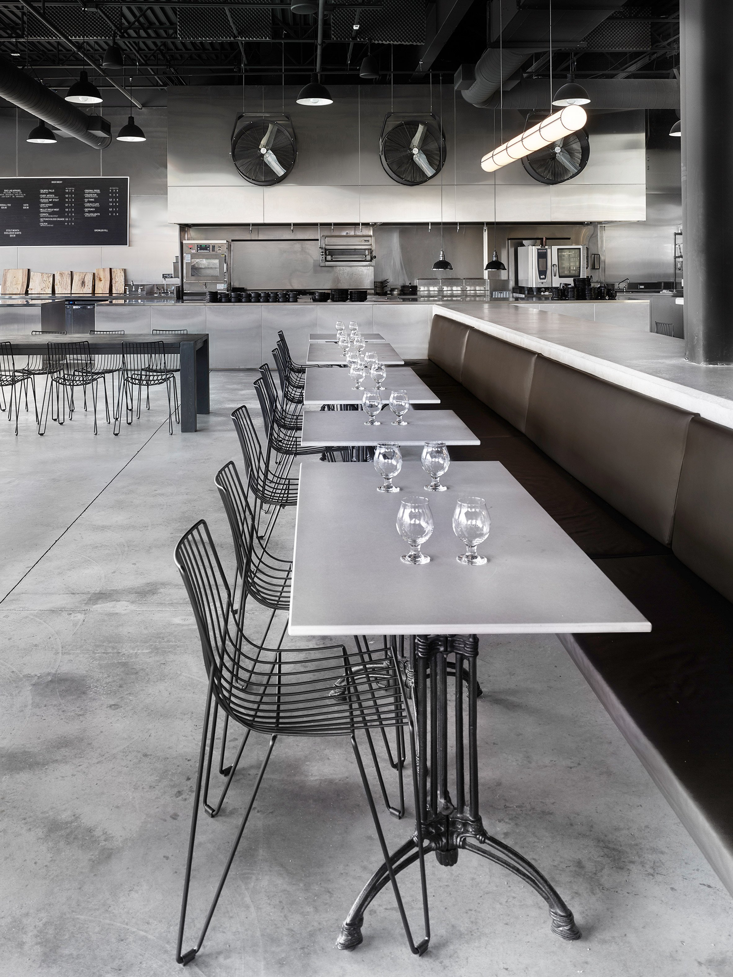
Contemporary, greyscale interiors compliment the stainless steel equipment at this brewery in New Hampshire, by Swedish firm Studio Richard Lindvall.

Bad Lab Beer Co brews and serves 16 draft beers on its site in Somersworth, an hour's drive north of Boston.

Bad Lab Beer Co by Studio Richard Lindvall

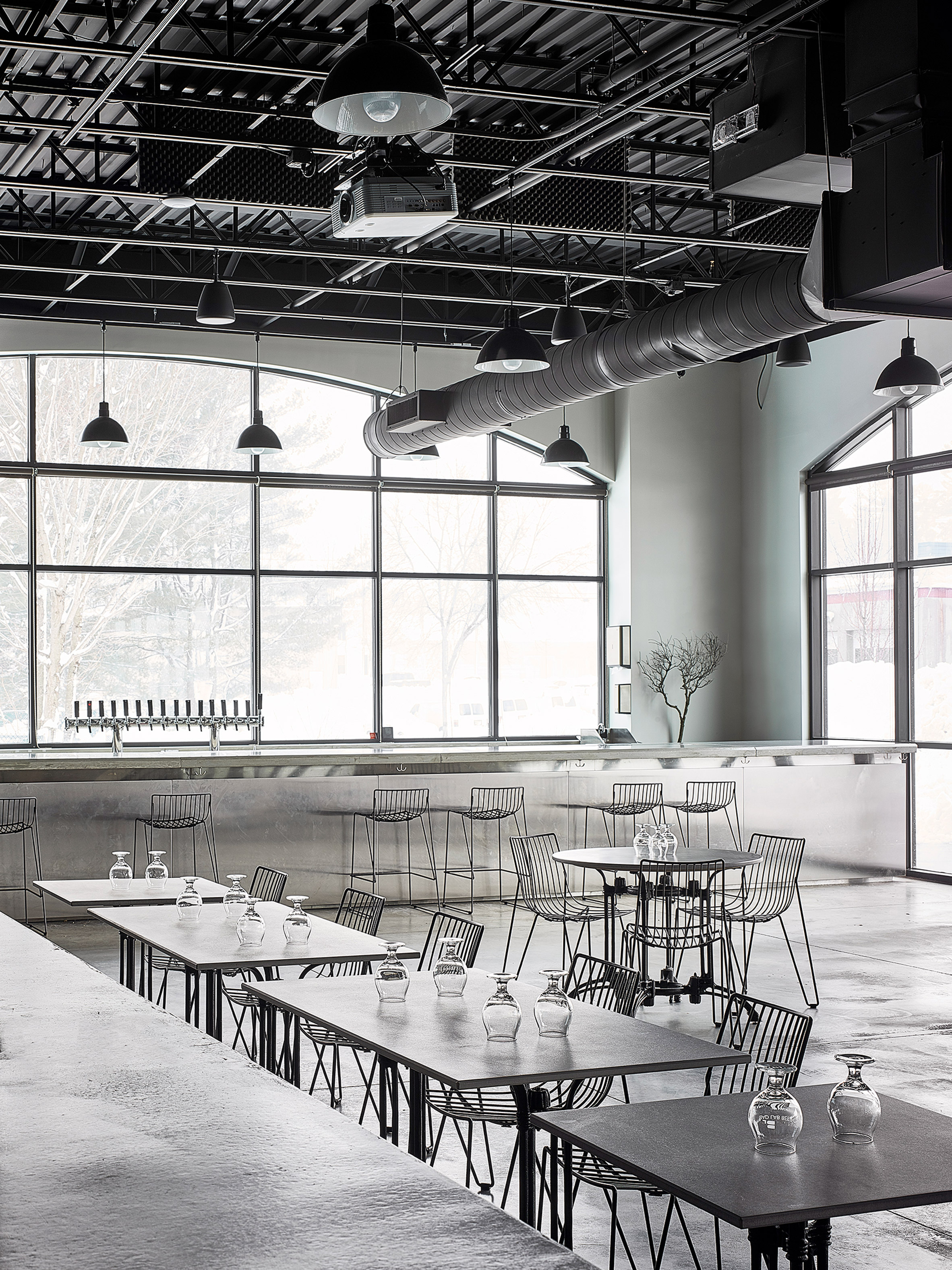
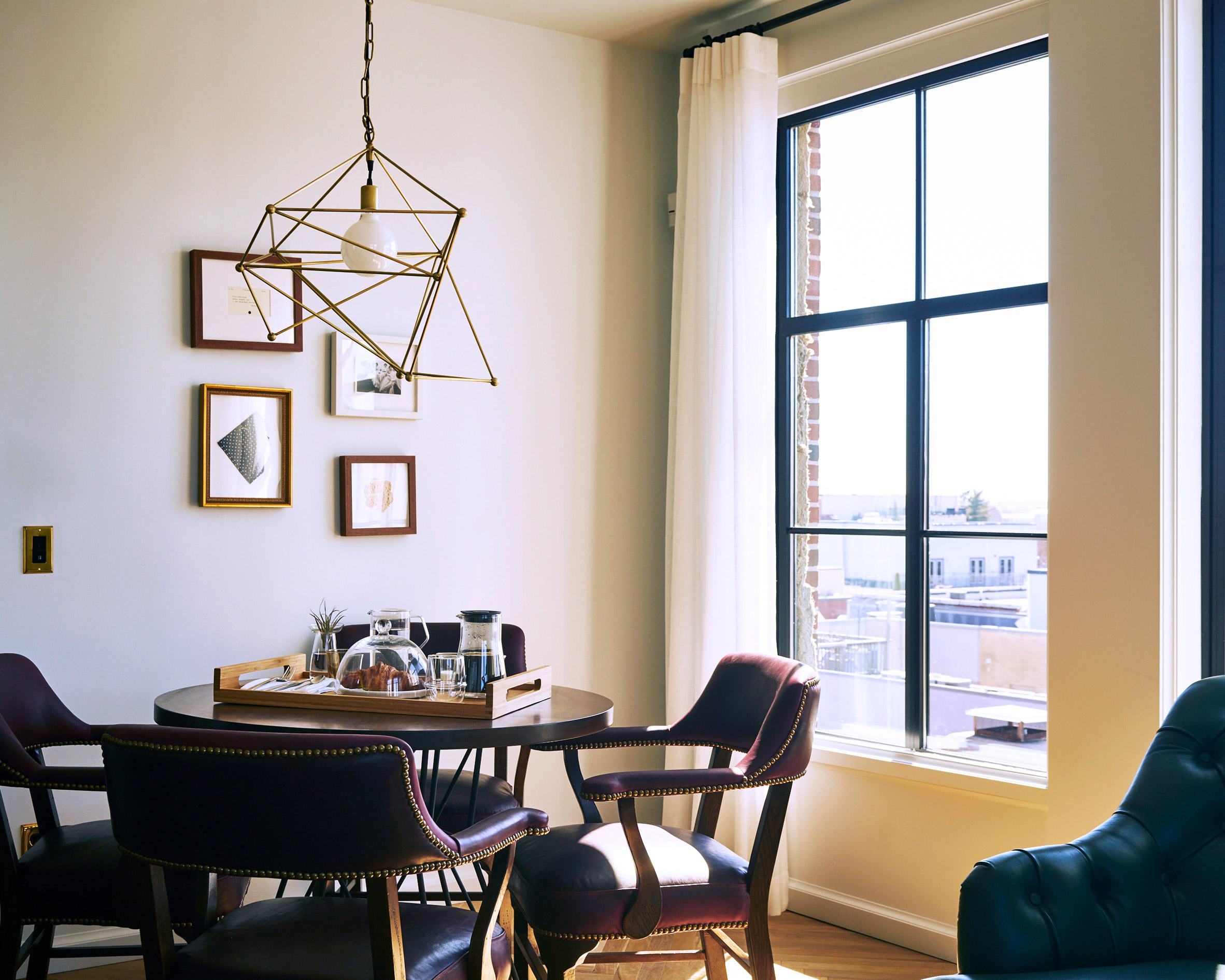
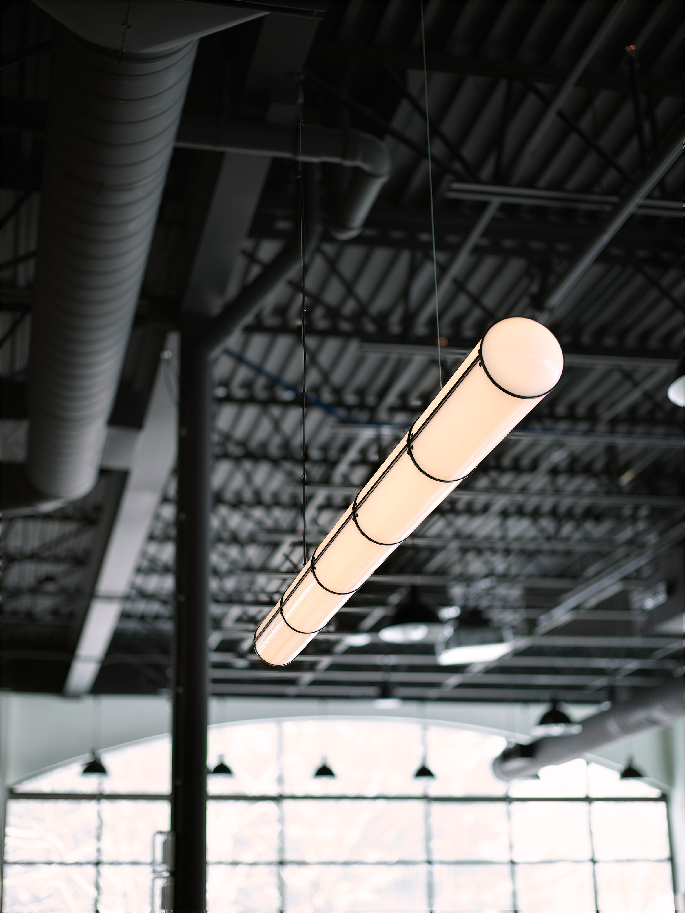
Housed within an old industrial building, the brewery features concrete floors, exposed ducts and large windows with black steel frames – all of which are highlighted by the pared-back interiors.

Based in Stockholm, Richard Lindvall led the design and drew influences from the architecture. "I wanted to build around the original details, only adding a few other materials to accentuate and compliment the simple and industrial feeling of the space," he said.

Bad Lab Beer Co by Studio Richard Lindvall

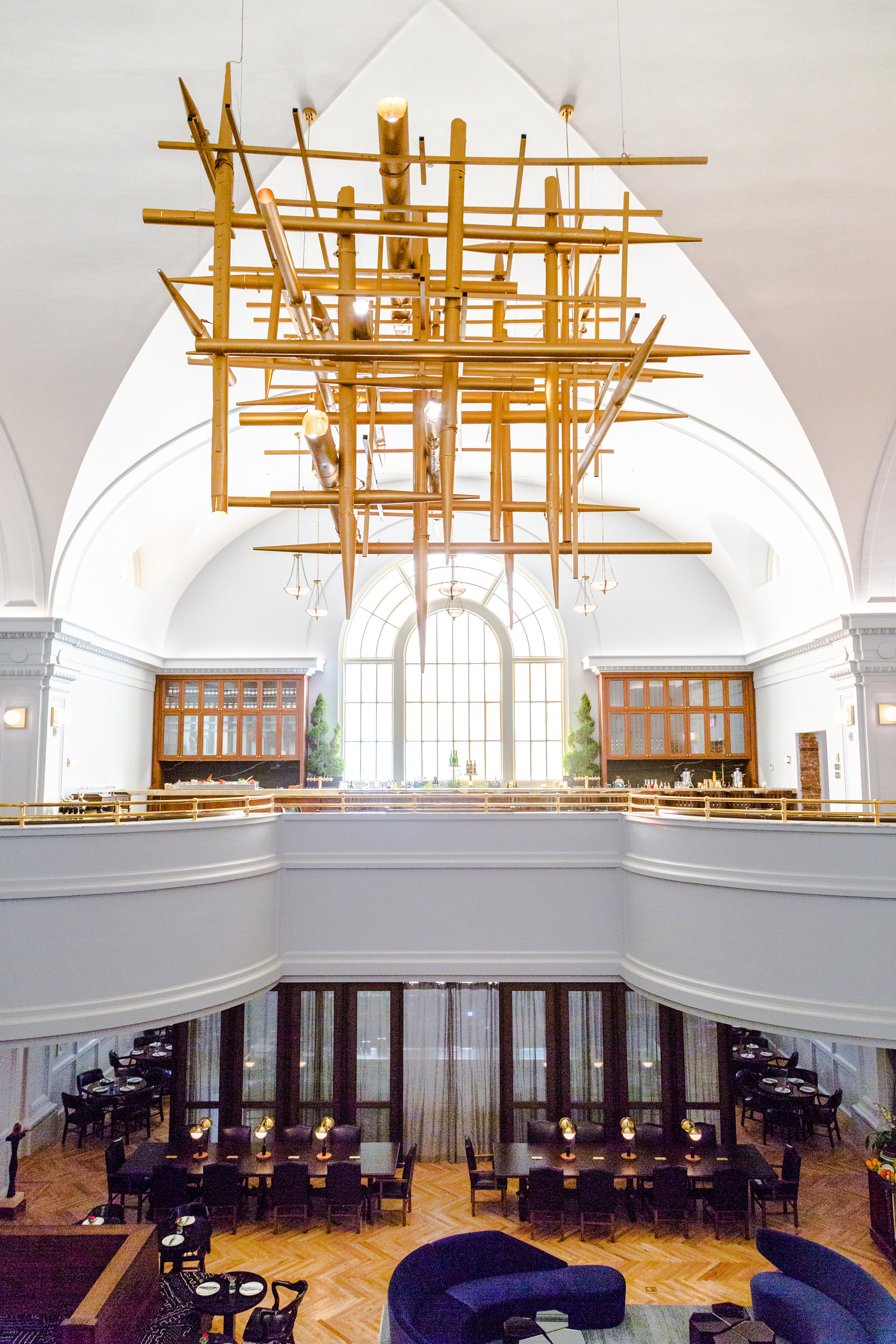
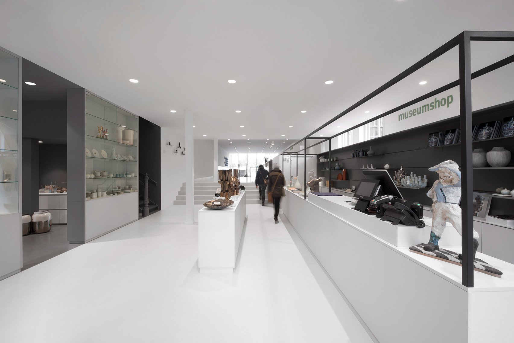
The layout includes a spacious dining room with ample natural light, and an open kitchen. Various high-top counters offer places to drink, with brewing facilities and restrooms located in the rear.

Stainless steel kitchen fittings match the brewery tanks, revealed by a glass wall in the dining area.

"My client wanted to create a restaurant and bar that would be a unique community gathering space where guests can interact with the bar and kitchen," Lindvall said.

To separate the main dining area from a beer tasting space near the core of the property, Lindvall installed a 33-foot-long (10-metre) concrete counter, cast in-situ. One side incorporates a bench for dining, with storage on the other.

Bad Lab Beer Co by Studio Richard Lindvall

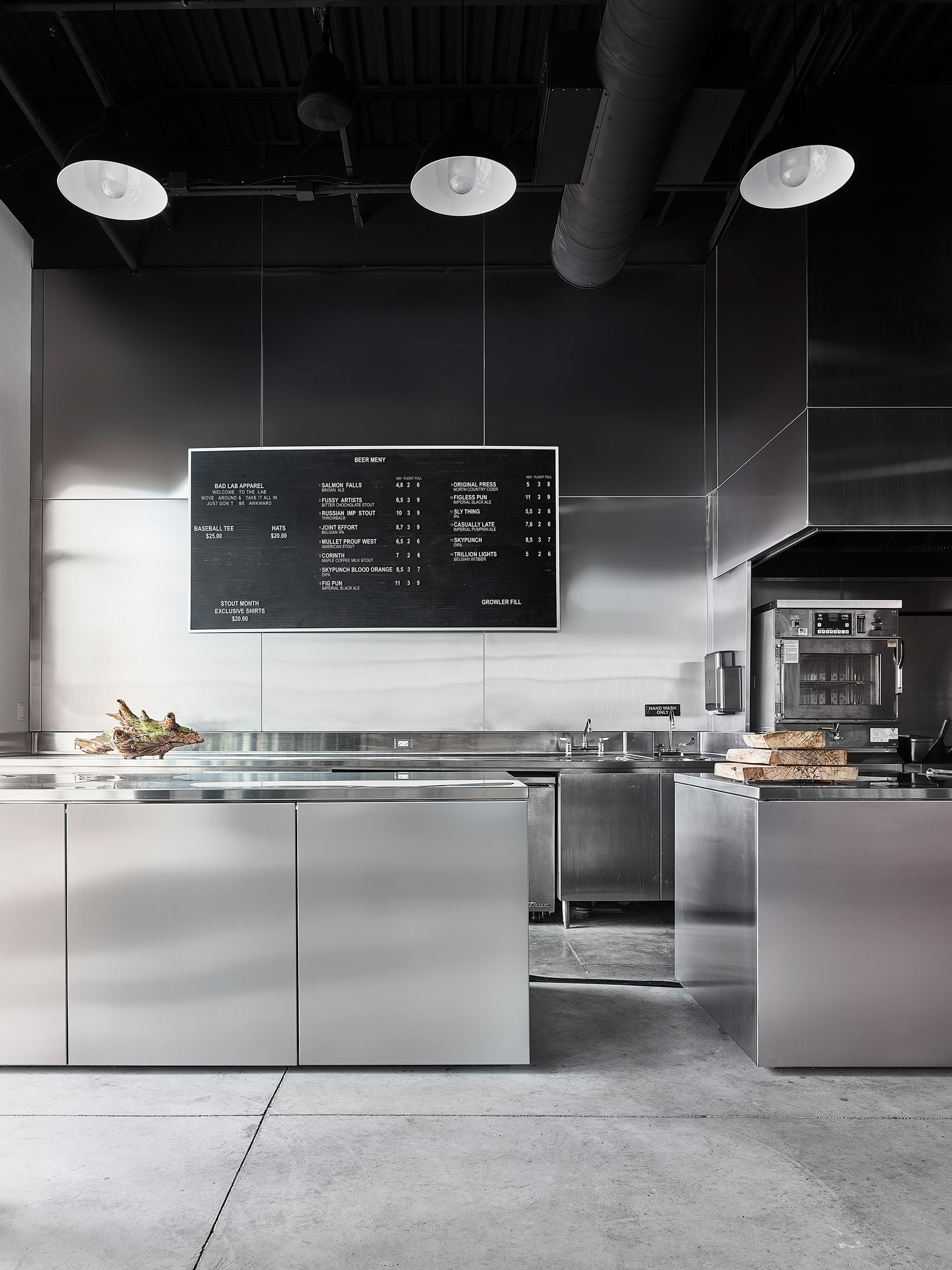
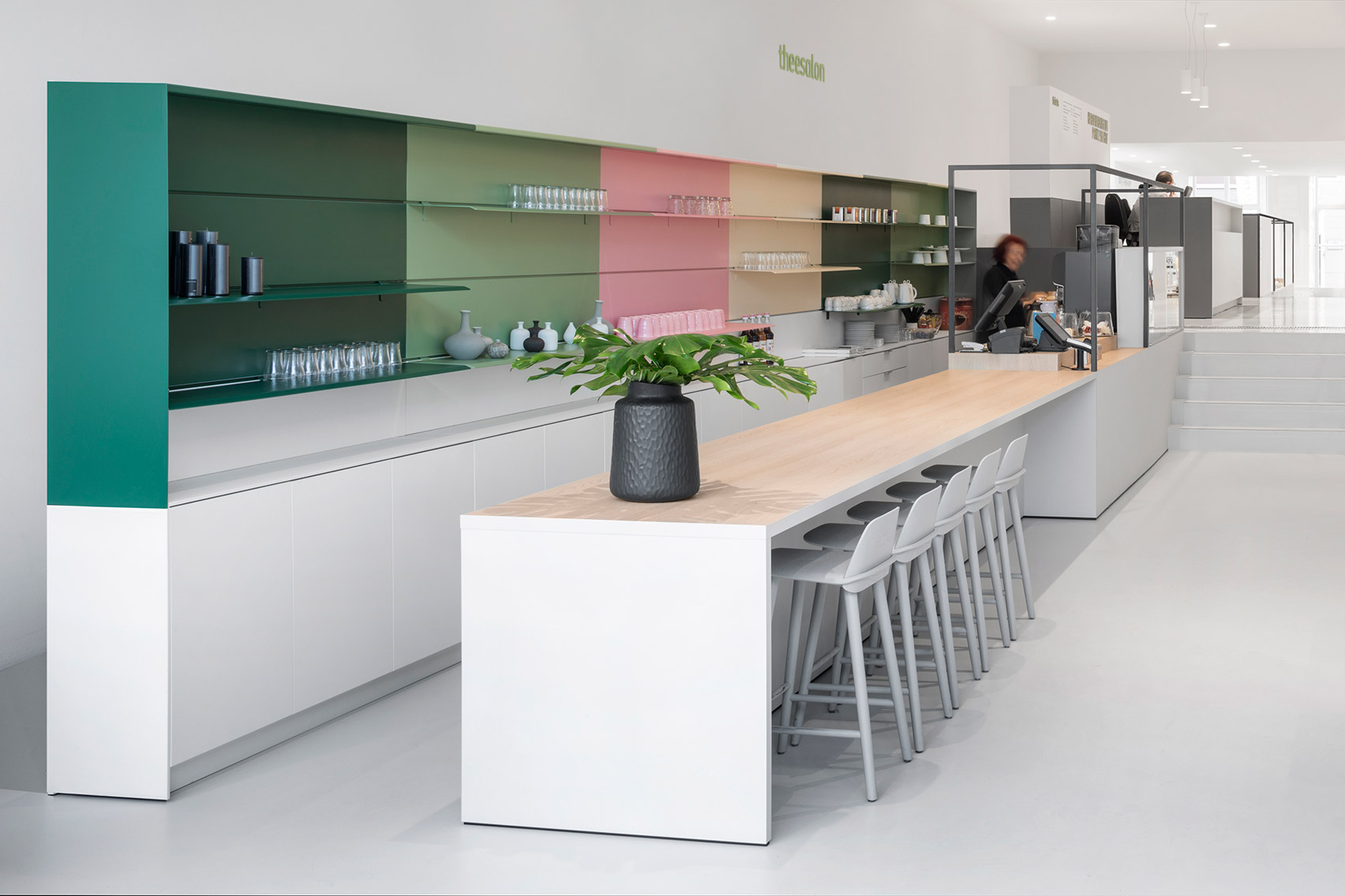
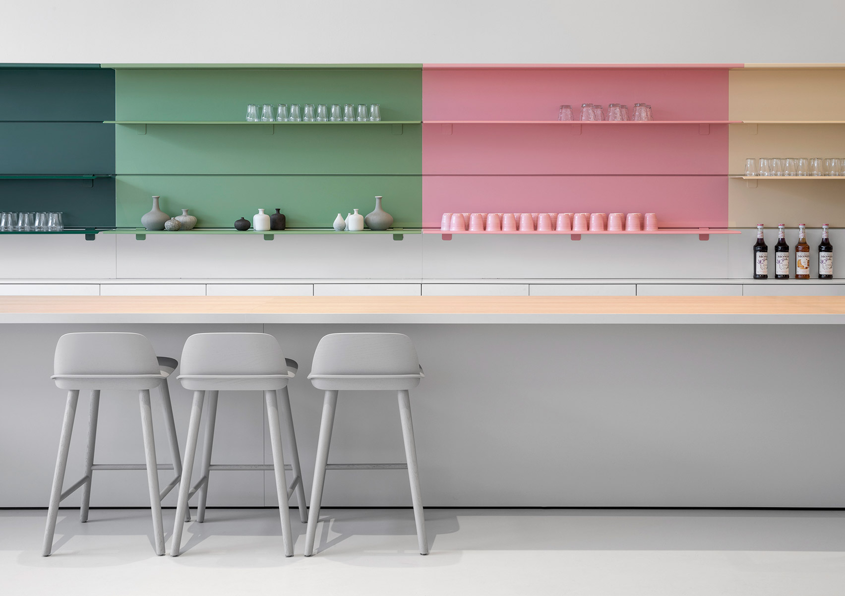
Light grey engineered wood covers the cabinets and tabletops to create a monochrome effect overall.

Black steel also features prominently: on window panes, three large industrial fans, chairs and table stands.

Bad Lab Beer Co by Studio Richard Lindvall

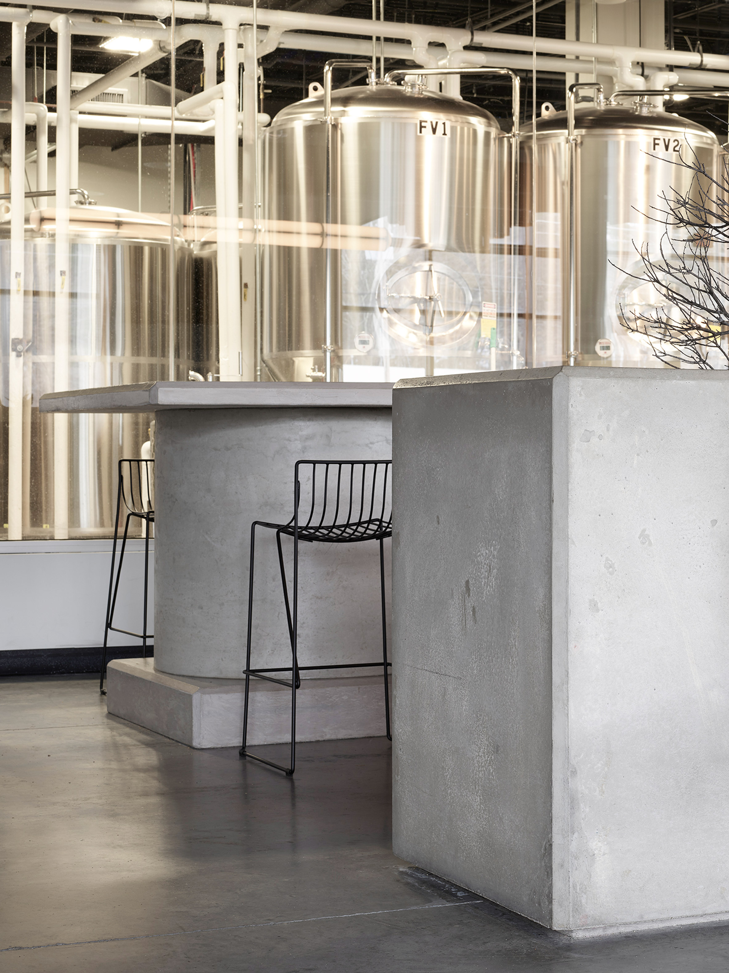
Bar stools and dining chairs are from Swedish company Massproductions, while a cylindrical pendant lamp was sourced from New York company Roll & Hill.

To add colour and warmth, Lindvall selected dark brown leather for a built-in bench, as well as natural decorative objects like tree branches. Sunlight also softens the brewery with its warm glow.

Bad Lab Beer Co by Studio Richard Lindvall

"When the sun comes through the windows and reflects on the kitchen it makes the steel warm and throughout the day it gives different effects depending on how light travels," he said.

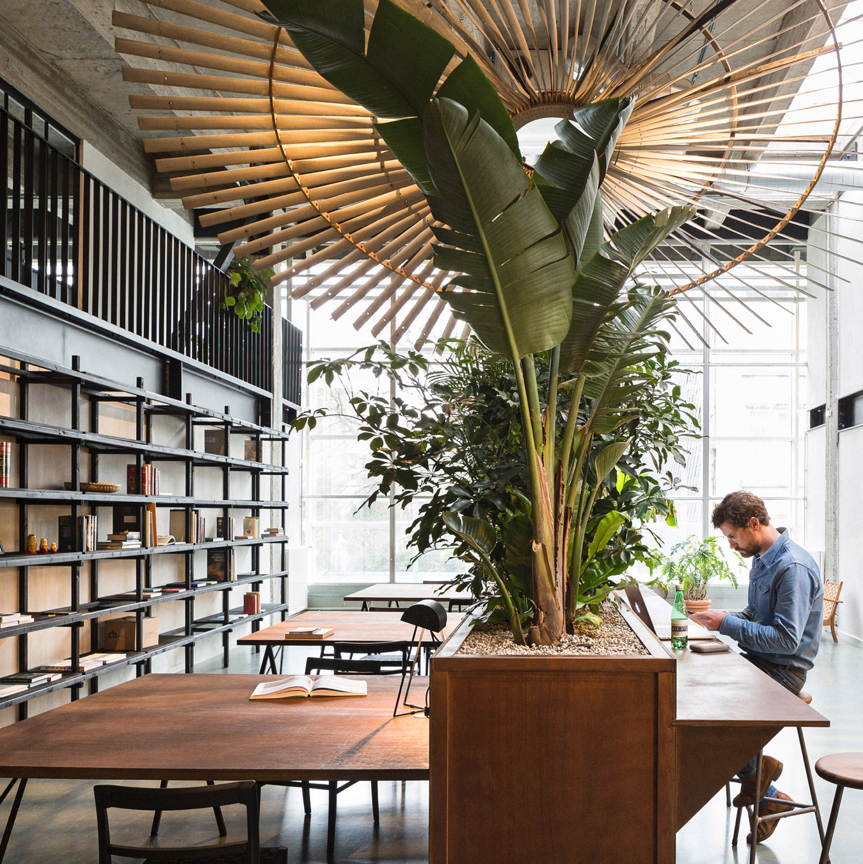
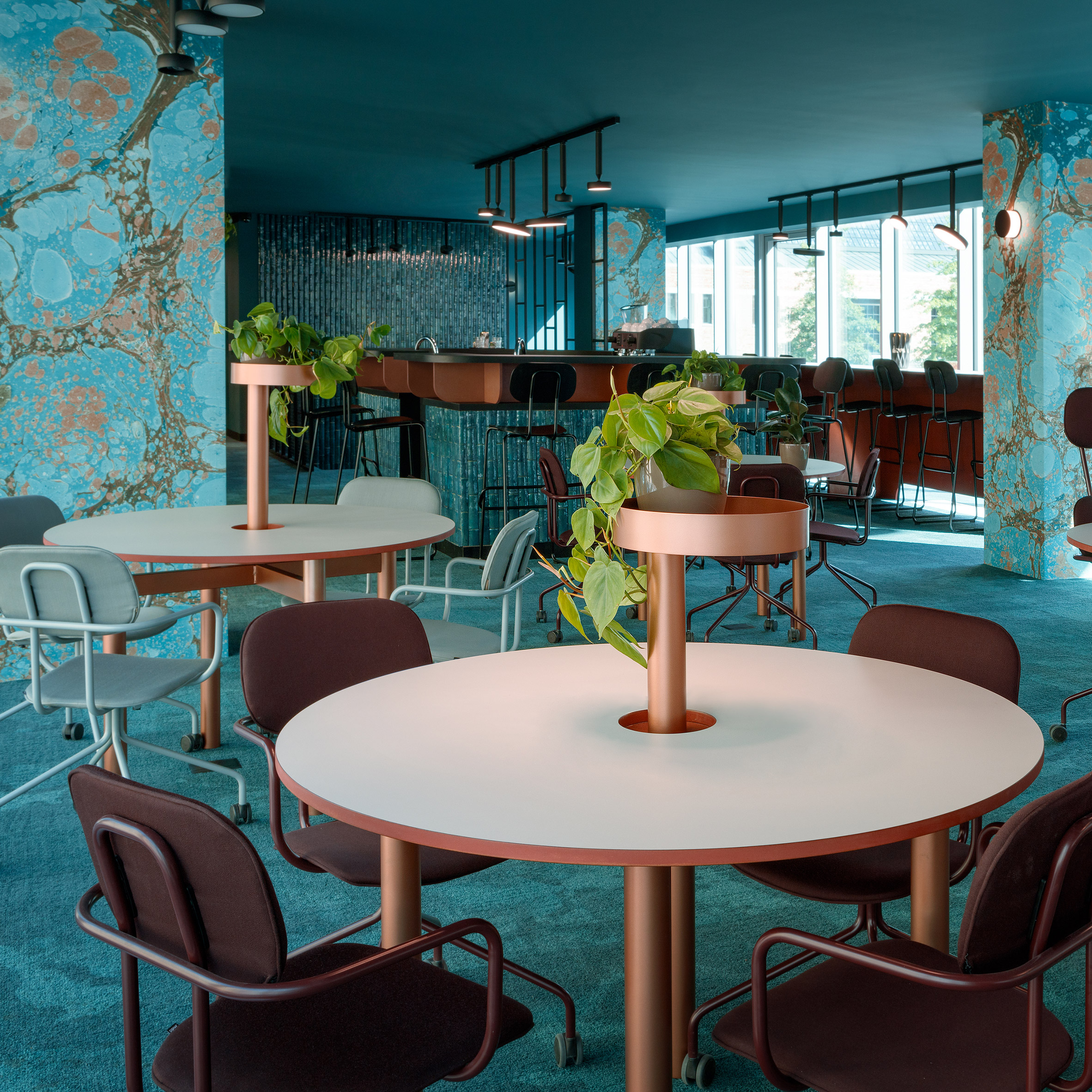
Lindvall has designed several other eateries, including a pale restaurant housed in a former sausage factory, and a greyscale bar with copper accents – both in Stockholm.

Photography is by Johan Annerfelt.

The post Bad Lab Beer Co brewery in New Hampshire features steely interiors by Richard Lindvall appeared first on Dezeen.

Tuesday, October 30, 2018

Mismatched furnishings create "bipartisan aesthetic" at The Line DC hotel

A mash-up of different styles is used to decorate this hotel in Washington DC, which New York firm INC Architecture and Design created inside an old church.

The Line DC by INC Architecture and Design

The Line DC hotel is located in an 110-year-old church in Washington DC's Adams Morgan neighbourhood. The neoclassical marble-clad structure is fronted by pillars and features 60-foot (18-metre) vaulted ceilings, millwork and brass detailing inside.

The Line DC by INC Architecture and Design

INC Architecture and Design overhauled the historic building to create the hotel's lobby, two bars and two restaurants, while a new mid-rise masonry construction at the rear accommodates 220 guest rooms.

The Line DC by INC Architecture and Design

Inside, mismatched furnishings are placed together to convey an old-meets-new design. Inside the lobby, church organ pipes have been repurposed as an architectural chandelier, and pews act as seating. Curvy, cobalt sofas fill the spacious entrance.

The Line DC by INC Architecture and Design

Other pieces include upholstered leather dining chairs and writing desks evocative of a lawyer's office, alongside hexagonal Moroccan coffee tables, and minimal wood and chrome designs.

"The Line DC is the ultimate mash-up of old-school homage and vanguard progressiveness," said a project description from INC Architecture and Design. "A bipartisan aesthetic, if you will."

The Line DC by INC Architecture and Design

Throughout the hotel, walls are kept white so as not distract from the eclectic mix of furnishings, while herringbone wood floors are a nod to the site's historic features.

Each room has a custom brass bed frame, a solid oak writing desk, and a variety of side tables and other furniture that convey a juxtaposition of old and new.

The Line DC by INC Architecture and Design

Also included are mini libraries populated with volumes from neighbourhood store Idle Times Books, and granite bookends by local furniture maker and musician Jonah Takagi.

The Line DC by INC Architecture and Design

For food and drinks, guests can pick from the choice of A Rake's Progress restaurant and bar, The Cup We All Race 4 coffee shop, American restaurant Brothers and Sisters, and Japanese eatery Spoken English.

The Line DC by INC Architecture and Design

The Line DC also boasts a fitness room, a spacious rooftop, and its own radio station – a feature also found at the city's Eaton Workshop hotel.

This is the third hotel in the Line chain to open in the US, following outposts in Austin and Los Angeles – all managed by Sydell Group.

The post Mismatched furnishings create "bipartisan aesthetic" at The Line DC hotel appeared first on Dezeen.

Valentí Albareda turns bomb-blasted banana warehouse in Barcelona into triplex apartment

Crumbling brick surfaces hint at the rich past of this triplex apartment in Barcelona, designed by architect Valentí Albareda with arch-shaped openings and warm oak floors.

Triplex At Sant Antoni by Valentí Albareda Tiana

The three-floor apartment is set within a former warehouse in Barcelona's up-and-coming Sant Antoni neighbourhood.

Originally built in the early 1900s, the building was first used to store bananas that were shipped over from the Canary Islands, before it was partially destroyed by a number of air raids during the Spanish civil war.

Locally-based architect Valentí Albareda has converted the site into living quarters for a young couple hailing from Ibiza and Dubai.

Triplex At Sant Antoni by Valentí Albareda Tiana

"From the beginning, the project brief was to improve the use and quality of this [building], and create flexible spaces without enclosing them into conventional room types," he explained.

"The result is a dwelling that fulfils [the inhabitant's] necessities, while respecting the original space's soul."

Triplex At Sant Antoni by Valentí Albareda Tiana

Albareda and his team began by making a series of structural changes to make the building seem more liveable. The rear wall of the existing basement has been punctuated with a pair of vaulted openings to reveal a small indoor courtyard.

Dressed with a handful of potted plants, this space is topped by a panel of gridded metal that allows day light to filter through from the upper reaches of the property.

Triplex At Sant Antoni by Valentí Albareda Tiana

A section of the attic floor – which has largely been reconstructed with steel – has been removed to make room for a chunky staircase that leads to the master bedroom. Panels of glass have also been integrated into the floor to give the illusion of height in the living area that sits directly underneath.

Albareda was also responsible for completing the apartment's interiors, which have been shortlisted in the inaugural Dezeen Awards.

Several of the rough stone walls have been left in their found state, the studio has freshened up the space with new oak parquet floors, fresh white cabinetry in the kitchen, and black-frame dining chairs.

Triplex At Sant Antoni by Valentí Albareda Tiana

Touches of warmth are provided by exposed timber ceiling beams and thin ceramic bricks, known as rasilla, which have been used to form the steps of a secondary stairwell. A large panel of glazing partially screened by wooden slats also forms the home's entrance, replacing a typical warehouse-style iron shutter door.

Last year architecture studio Emulsion took a more contemporary approach for the renovation of a triplex apartment in London's brutalist Barbican Estate, where they created a series Le Corbusier-inspired colour-block walls.

Photography is by José Hevia.


Project credits:

Architecture: Valentí Albareda
Construction: Metric

The post Valentí Albareda turns bomb-blasted banana warehouse in Barcelona into triplex apartment appeared first on Dezeen.

Metric turns bomb-blasted banana warehouse in Barcelona into triplex apartment

Crumbling brick surfaces hint at the rich past of this triplex apartment in Barcelona, designed by architecture studio Metric with arch-shaped openings and warm oak floors.

Triplex At Sant Antoni by Valentí Albareda Tiana

The three-floor apartment is set within a former warehouse in Barcelona's up-and-coming Sant Antoni neighbourhood.

Originally built in the early 1900s, the building was first used to store bananas that were shipped over from the Canary Islands, before it was partially destroyed by a number of air raids during the Spanish civil war.

Locally-based architecture studio Metric has converted the site into living quarters for a young couple hailing from Ibiza and Dubai.

Triplex At Sant Antoni by Valentí Albareda Tiana

"From the beginning, the project brief was to improve the use and quality of this [building], and create flexible spaces without enclosing them into conventional room types," explained Valentí Albareda Tiana, an architect at the studio.

"The result is a dwelling that fulfils [the inhabitant's] necessities, while respecting the original space's soul."

Triplex At Sant Antoni by Valentí Albareda Tiana

Tiana and her team began by making a series of structural changes to make the building seem more liveable. The rear wall of the existing basement has been punctuated with a pair of vaulted openings to reveal a small indoor courtyard.

Dressed with a handful of potted plants, this space is topped by a panel of gridded metal that allows day light to filter through from the upper reaches of the property.

Triplex At Sant Antoni by Valentí Albareda Tiana

A section of the attic floor – which has largely been reconstructed with steel – has been removed to make room for a chunky staircase that leads to the master bedroom. Panels of glass have also been integrated into the floor to give the illusion of height in the living area that sits directly underneath.

Metric were also responsible for completing the apartment's interiors, which have been shortlisted in the inaugural Dezeen Awards.

Several of the rough stone walls have been left in their found state, the studio has freshened up the space with new oak parquet floors, fresh white cabinetry in the kitchen, and black-frame dining chairs.

Triplex At Sant Antoni by Valentí Albareda Tiana

Touches of warmth are provided by exposed timber ceiling beams and thin ceramic bricks, known as rasilla, which have been used to form the steps of a secondary stairwell. A large panel of glazing partially screened by wooden slats also forms the home's entrance, replacing a typical warehouse-style iron shutter door.

Last year architecture studio Emulsion took a more contemporary approach for the renovation of a triplex apartment in London's brutalist Barbican Estate, where they created a series Le Corbusier-inspired colour-block walls.

Photography is by José Hevia.

The post Metric turns bomb-blasted banana warehouse in Barcelona into triplex apartment appeared first on Dezeen.

Monday, October 29, 2018

Yoko Kitahara spa blends Japanese and Arabic designs in Jaffa

An Ottoman-era home in Jaffa has been refurbished as a spa, where Japanese elements sit alongside original Arabic details like arched ceilings and stone walls.

Designer Yoko Kitahara, who emigrated to Israel from Tokyo's Hayama seaside region over a decade ago, designed and developed the concept for the spa – which she also named after herself. She had some help from her husband Liran Benami, an architect who practises in nearby.

Yoko Kitahara

Spanning 2,691 square feet (250 square metres), and with 861 square feet (80 square metres) of balconies and rooftop space, the space was originally an Ottoman-era home in Jaffa's historic Old City (Kikar Kidumim).

Yoko Kitahara

Taking cues from the home's existing architecture, while relating them to Kitahara's Japanese heritage and years of training, the spa fuses Arabic and Asian influences in a succinct way.

The duo combined Japanese touches with the retained 300-year-old details, rather than drastically overhauling the space.

Yoko Kitahara

The renovation took a year and a half to complete, and was handled by local craftsmen. The team preserved the vaults and arches, and an arched glass vitrage – the only spot of strong colour in the space.

Yoko Kitahara

"It was important for me to do it [the renovation] in a way that would leave the original structure and shape of the Ottoman architecture visible and present, but to give it a minimalistic feel," Kitahara told Dezeen.

Natural plaster covers all of the surfaces, blending the walls with the ceilings to give a unified look, while retaining the original drama of the site.

Yoko Kitahara

Old window frames were replaced with custom-made thin steel, to maximise the views of the Mediterranean.

Much of the floor plan of the former home was left intact, with bedrooms turned into treatment rooms, and a kitchen for preparing tea and snacks.

Yoko Kitahara

One area is a now traditional tatami room, for which the woven mats needed to be custom-cut to fit the room's irregular shape.

Other cabinets have arched tops and reflect the arched ceilings, and were painted white to not interfere with the quiet visual atmosphere.

Yoko Kitahara

"Almost all the objects and accessories we use are imported from Japan by me – all the light elements, the trays, cups, wood bowls, sleepers, incense, defusers, pottery, the tea we serve and even also the robes and towels," said Kitahara.

Wooden bins for foot baths – known as Ashiyu – are made from natural Japanese Hinoki wood. "It has a wonderful fragrance, and it is very light and strong wood with beautiful light colour," the designer said.

Yoko Kitahara

The two-storey rooftop, which was neglected previously, was also renovated and offers panoramic views of the city and nearby Tel Aviv.

Jaffa is well known for its Arabic architecture, and many projects completed there are reflective of the city's historic charm. Examples include Jaffa House by Pitsou Kedem, where vaulted ceilings and stone walls were also exposed, and John Pawson's transformation of an old convent into the Jaffa Hotel.

Photography is by Sasha Zacks.

The post Yoko Kitahara spa blends Japanese and Arabic designs in Jaffa appeared first on Dezeen.

i29 revamps interiors of Princessehof ceramics museum in Leeuwarden

Dutch interior architecture firm i29 has completed a contemporary renovation of the 18th-century buildings of the Princessehof National Museum of Ceramics in the Dutch city of Leeuwarden.

Unveiled to coincide with the Princesshof museum's 100th birthday, and the city of Leeuwarden being named as the European Capital of Culture 2018, the museum has undergone a major renovation of its entrance and exhibition spaces.

Princessehof Ceramics Museum by i29

i29 has designed the interiors of the entrance hall, which include a shop and a tearoom, as well as all the exhibition rooms that house the museum's vast collections.

"The main challenge was to create a welcoming and contemporary entrance area in the rather closed monumental buildings," said the studio. "A timeless interior that matches the museum as a place for inspiration and surprise."

Princessehof Ceramics Museum by i29

A bright and spacious open-plan layout in the entrance area allows visitors to access the museum from both the front and back entrance, and also gives them a chance to peruse the tearoom and museum store on their way in and out.

Laid out in a horizontal line on varying different floor levels, the tearoom, store and ticket desk subtly reference layers of earth used to make ceramics.

Princessehof Ceramics Museum by i29

Integrated ramps slotted in behind the counters of each area provide disabled access while a large garden adjacent to the tearoom has also been made accessible.

"To create an intensive experience throughout the various spaces we added clear contrasts, which is most visible on the passage areas," explained the studio. "For example, the tearoom features vibrant fresh colours, while the museum store, in contrast, has tranquil grey tones so that all of the attention is focused on the products."

Princessehof Ceramics Museum by i29

Other notable areas of contrast include the transition from the contemporary entrance area to the monumental museum square where the walls are lined with hand-painted wallpaper.

Here visitors can view a sleek graphical installation that incorporates benches and information screens.

Princessehof Ceramics Museum by i29

In the exhibition areas, the firm worked in collaboration with agency The Ambassadors of Aesthetics to create a new layout for the museum's collections that could provide a clear and stimulating experience for visitors.

The Ambassadors of Aesthetics researched the original 18th century colours used in the building which were restored in the exhibition rooms.

For the museum's Mass Production room, the designers created an installation made of simply stacked, brightly lit white boxes where visitors are fully encircled by ceramics.

Princessehof Ceramics Museum by i29

This installation leads to the Art Nouveau room, where the opposite effect has been created. The room has been completely darkened, isolating the exhibited objects and making them appear as if they are "floating in the air".

"The pronounced simplicity of the design interventions contrasts with the monumental shell," said the designers.

"The contrast between old/new and monumental/contemporary complements each other, and together they form a powerful and surprising whole. It places the monument back into the here and now, not only in a functional sense."

Princessehof Ceramics Museum by i29

From a subterranean Roman temple to a restored textile factory, you can read about other institutions with impressive interiors in our round-up of museums that are worth a visit for the interiors alone.

Photography is by Ewout Huibers.

The post i29 revamps interiors of Princessehof ceramics museum in Leeuwarden appeared first on Dezeen.

Sunday, October 28, 2018

John Wardle Architects restores and extends Captain Kelly's forgotten Tasmanian cottage

Australian studio John Wardle Architects has painstakingly restored an original weatherboard cottage in a remote bay on Bruny Island in Tasmania.

The 320-sqaure-metre cottage dates back to the 1840s when it was built by its namesake, Captain Kelly – a harbourmaster who was noted for his voyage around Tasmania in a whaleboat and for being the first Australian to enter the Antarctic Circle in 1832.

Captain Kelly's Cottage by John Wardle Architects

John Wardle Architects has restored the dilapidated Georgian dwelling to its original condition, while also adding contemporary interventions to the interiors to bring them up to date. The finished result earned the firm a place on the shortlist in the House interior category of 2018 Dezeen Awards.

"The original cottage was deteriorating due to its age and its harsh environment," explained the architect.

"Over 175 years there had been many unsympathetic alterations to the small cottage. Part of our work involved the removal of these non-original works, to respectfully return the cottage to its original form."

Captain Kelly's Cottage by John Wardle Architects

By tracking through libraries, original diaries, and detailed logbooks, the architects discovered that the various ship hands of Captain Kelly may have built the house during the whaling off-season for Kelly and his daughter to live in.

The original cottage consisted of two structures – one containing bedrooms and the other a kitchen, surrounded by a wide verandah.

Captain Kelly's Cottage by John Wardle Architects

The architects inserted a number of contemporary interventions within the heritage structure to make the building suitable for modern day living.

A new living area, which has been placed between the existing kitchen and bedroom structures, is filled with built-in and custom-made loose furniture including a writing desk and coffee table designed from materials left over at the end of construction.

A full-length window seat with flat cushions upholstered in fabrics from Portugal has views to the bay. The curtains were purchased in Kolkata, the tiles in Tokoname in Japan and the light fittings from Milan

Captain Kelly's Cottage by John Wardle Architects

"These global imports accord with those parts of the house: its windows, doors, staircase, paint and nails not available at the time in the new colony," explained the architects.

"All of the timber for structure, floors, walls, ceilings, windows, cabinetry and furniture were produced from a single pack of Tasmanian Oak sourced from a local mill, as were the original primary elements of the construction."

Captain Kelly's Cottage by John Wardle Architects

The original layered soffit and exposed ceiling rafters on the cottage's verandah have been continued into the new entry and living spaces to create continuity between the old and new structures.

"In effect, the verandah extends and encapsulates the new works tying new and old together," explained John Wardle Architects. "This is reflected both in plan and section."

Captain Kelly's Cottage by John Wardle Architects

The cottage's original kitchen was restored with its 1960s profile weatherboards removed and original profiled boards fabricated and installed externally. Evidence of an old bread oven prompted the architects to create a new brick oven and cast iron facing incorporated into the masonry wall.

A sheltered north-facing courtyard built around existing 100-year-old walnut and mulberry trees has been inserted into the leeward side of the cottage while the chimney, which had long since been removed, has been reinstated in its original position. Made of white ghost bricks, the architects said that the new replica chimney "helps to define and warm the courtyard space".

Captain Kelly's Cottage by John Wardle Architects

In addition to the new structures, the restoration process involved the removal of many layers of paint that led to the discovery of the original colours. These have been revealed in parts and provided inspiration in other areas of the house.

Yellowing newspaper clippings found under paint are also on show. Meanwhile old construction techniques that were uncovered have been incorporated into the cottage's new works where possible.

Also shortlisted in the House interior category is this church conversion in Islington, London, which uses materials as sparingly as possible to match the owner's pared-back lifestyle.

Photography is by Trevor Mein.


Project credits:

Architecture practice: John Wardle Architects
Project team: John Wardle, 
Andrew Wong, 
Danielle Peck
Construction team: Scott Cordwell, Cordwell Lane Builders
Structural engineer: Gandy & Roberts Consulting Engineers
Building surveyor: Holdfast Building Surveyors
Architectural historian: John Matthews

The post John Wardle Architects restores and extends Captain Kelly's forgotten Tasmanian cottage appeared first on Dezeen.

Saturday, October 27, 2018

Seven shared offices that make working worthwhile

Co-working spaces offer an alternative to spending the nine-to-five in a dull desk cubicle. Interiors reporter Natasha Levy selects seven unusual examples from across the globe, including a shared office in a former distillery and a women-only workspace in New York.


Dezeen roundups: Co-working spaces

The Wing, USA, by Chiara de Rege

For the third outpost of women-only co-working space The Wing, interior designer Chiara de Rege created a series of homely work rooms furnished with plush, pastel-hued chairs and pendant lamps.

Tall shelves displaying colour-coordinated books can be pushed back to reveal hidden doorways.

Find out more about The Wing 


Dezeen roundups: Co-working spaces

Replica House Studios, UK, by Surman Weston

Diamond-patterned stained glass screens divide up this co-working space in north London as nod towards its past as a Methodist church.

Surman Weston purposefully kept the rest of the interior simple, with white-painted walls, oiled oak floors and plywood furniture.

Find out more about Replica House Studios 


Dezeen roundups: Co-working spaces

Guateque, Mexico, by Estudio Atemporal

Ping-pong tables with bright yellow boards for nets add a splash of colour to the otherwise industrial setting of this co-working space in Mexico City.

The office, which was formerly a factory, features concrete columns cinder block walls, and tall glass partitions – beams of black metal have then been used to form a reading nook at mezzanine level.

Find out more about Guateque 


Dezeen roundups: Co-working spaces

Canopy Jackson Square, USA, by Yves Behar, Amir Mortazavi and Steve Mohebi

A rich mix of blackened wood joinery, green leather chairs and Verdi Alpi marble walls appear inside the private meeting rooms of this shared workspace in San Francisco.

Contrast is offered in the bright communal areas, which have baby pink cabinetry and light timber tables.

Find out more about Canopy Jackson Square 


Dezeen roundups: Co-working spaces

The Distillery, Czech Republic, by Kogaa

Czech practice Kogaa brought this 19th-century distillery back from the brink of demolition by transforming it into an understated co-working space.

Left largely untouched during the renovation process, the office features crumbling walls, exposed ceiling beams, and even a drinks bar in its disused elevator shaft.

Find out more about The Distillery 


Dezeen roundups: Co-working spaces

Fosbury & Sons, Belgium, by Going East

Minimalist Danish furniture appears throughout the formal and casual workspaces of this shared office in Antwerp.

The greenery-filled building's internal layout was inspired by the experience of walking along New York's High Line, and is intended to allow visitors to "discover something new" upon each visit.

Find out more about Fosbury & Sons 


Dezeen roundups: Co-working spaces

The Nest, Poland, by Beza Projekt

Beza Project forwent a typically bland office colour scheme and instead covered the structural columns of this Warsaw co-working space with marbled turquoise wallpaper to create a club-like atmosphere.

This is heightened by feature walls clad in shimmering blue tiles and copper-edged desks.

See more co-working projects 

The post Seven shared offices that make working worthwhile appeared first on Dezeen.