John Pawson uses limestone and cherry wood for minimal Jil Sander shop in Tokyo
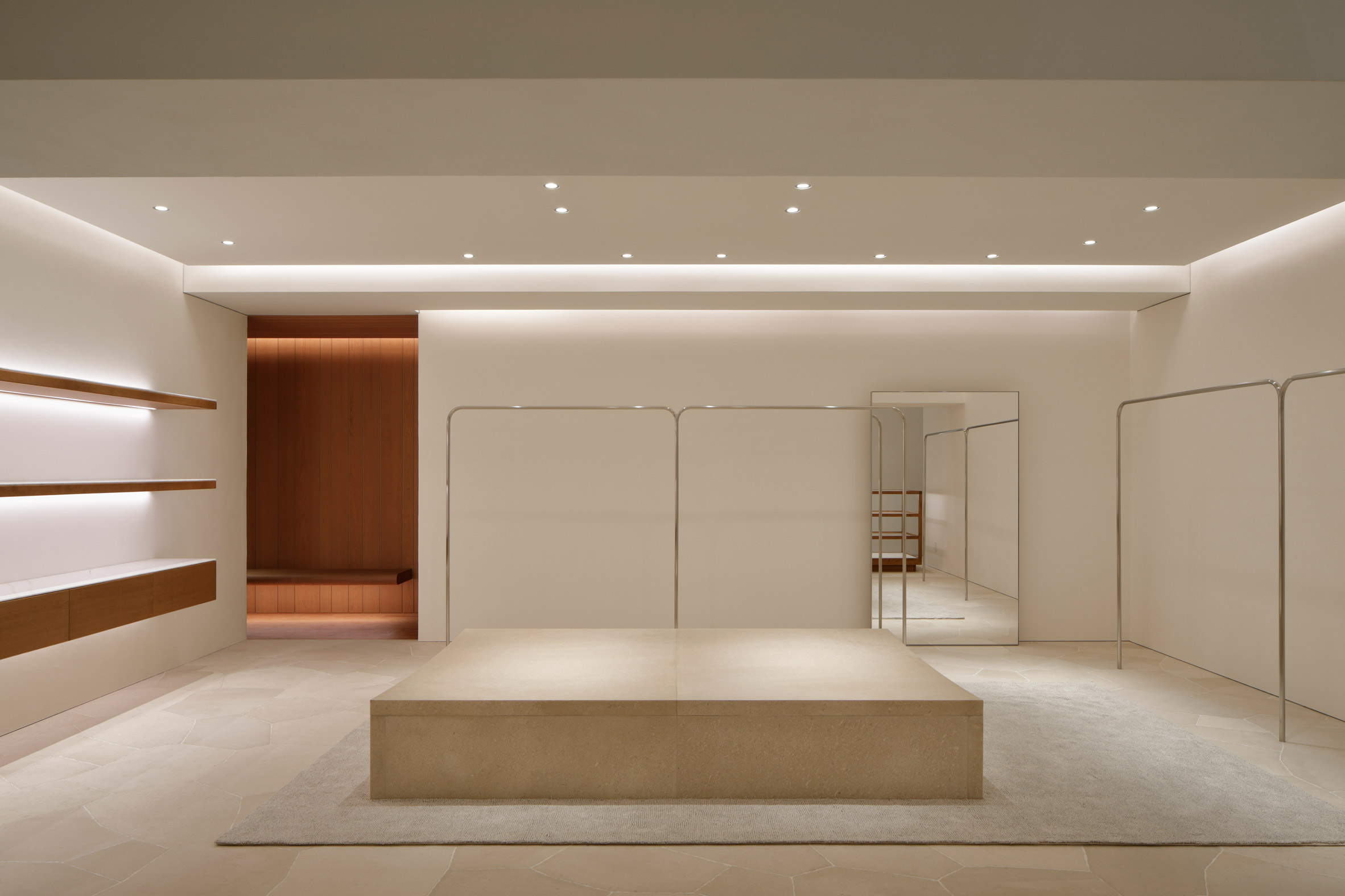
London-based designer John Pawson has created a minimalist interior for the new Japanese flagship store of fashion label Jil Sander, pairing pale limestone walls and floors with cherry wood accents.
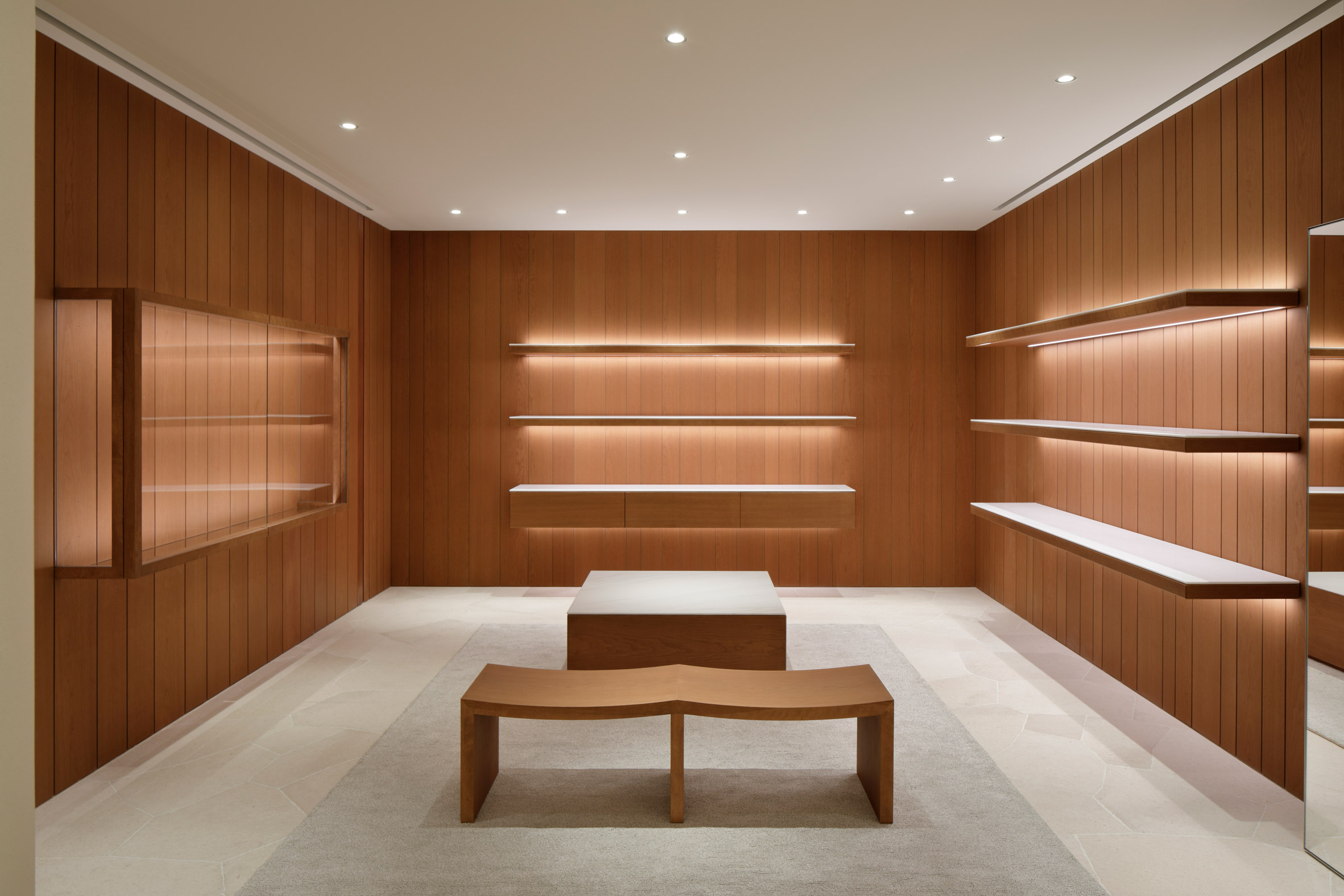
Situated in Omotesando, Tokyo's luxury shopping district, the shop is sparsely furnished. The only colour comes from the orange-toned wood, meaning the clothing and accessories can take centre stage.
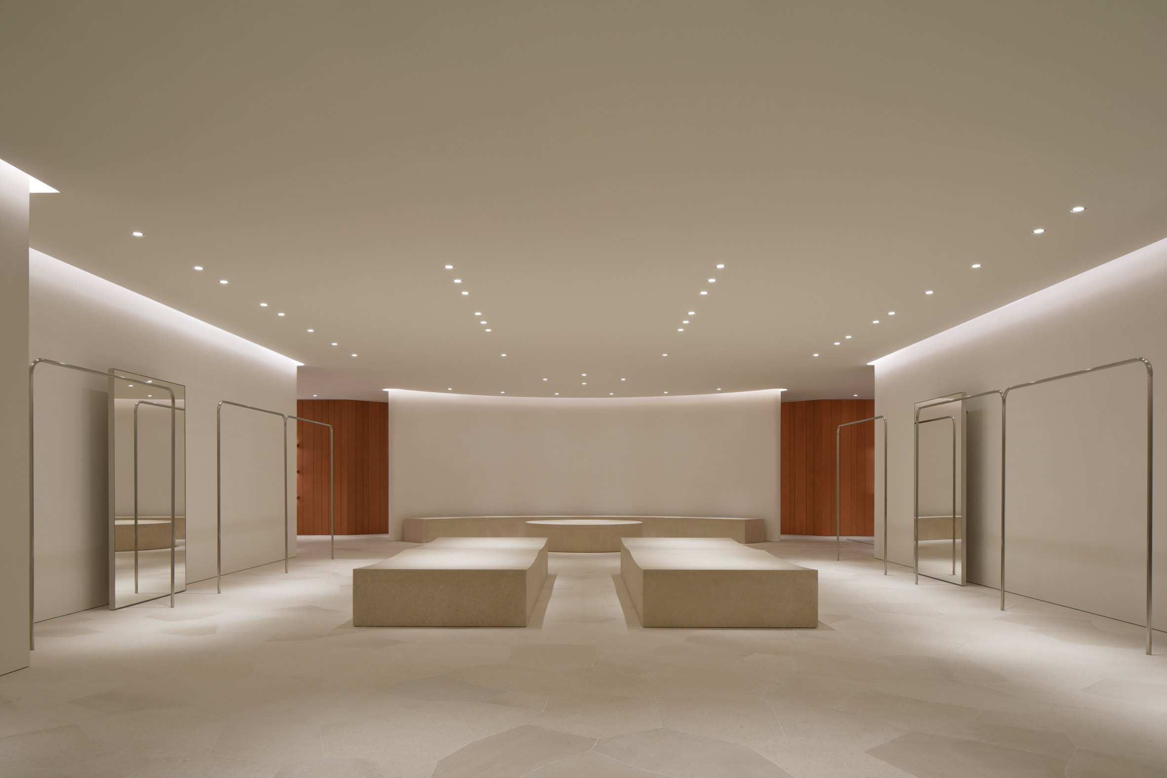
"Obviously there's a history to Jil Sander, and their personal approach to the clothes, and the sensibility of their interiors – of course it was going to be simple," Pawson told Dezeen.
"But the reason we try and keep things simple is so that you get to see the clothes or the merchandise clearly. It gives them a nice backdrop. And even more important is for people to feel good."
The brief given to Pawson by Lucie and Luke Meier, the married couple who head up Jil Sander, was to create a retail space featuring a "pure, warm, simple, soulful and warm" design.
"I got a call and I went to see them in Milan, and they shared with me a sort of mood book. It was just a really beautifully put together book of things that inspired them – which was quite funny, because clients normally wait to see what you do," Pawson explained.
"Many of their ideas were so original, but they could have been things that I would have put together. So it just proved that we were very much in sync."
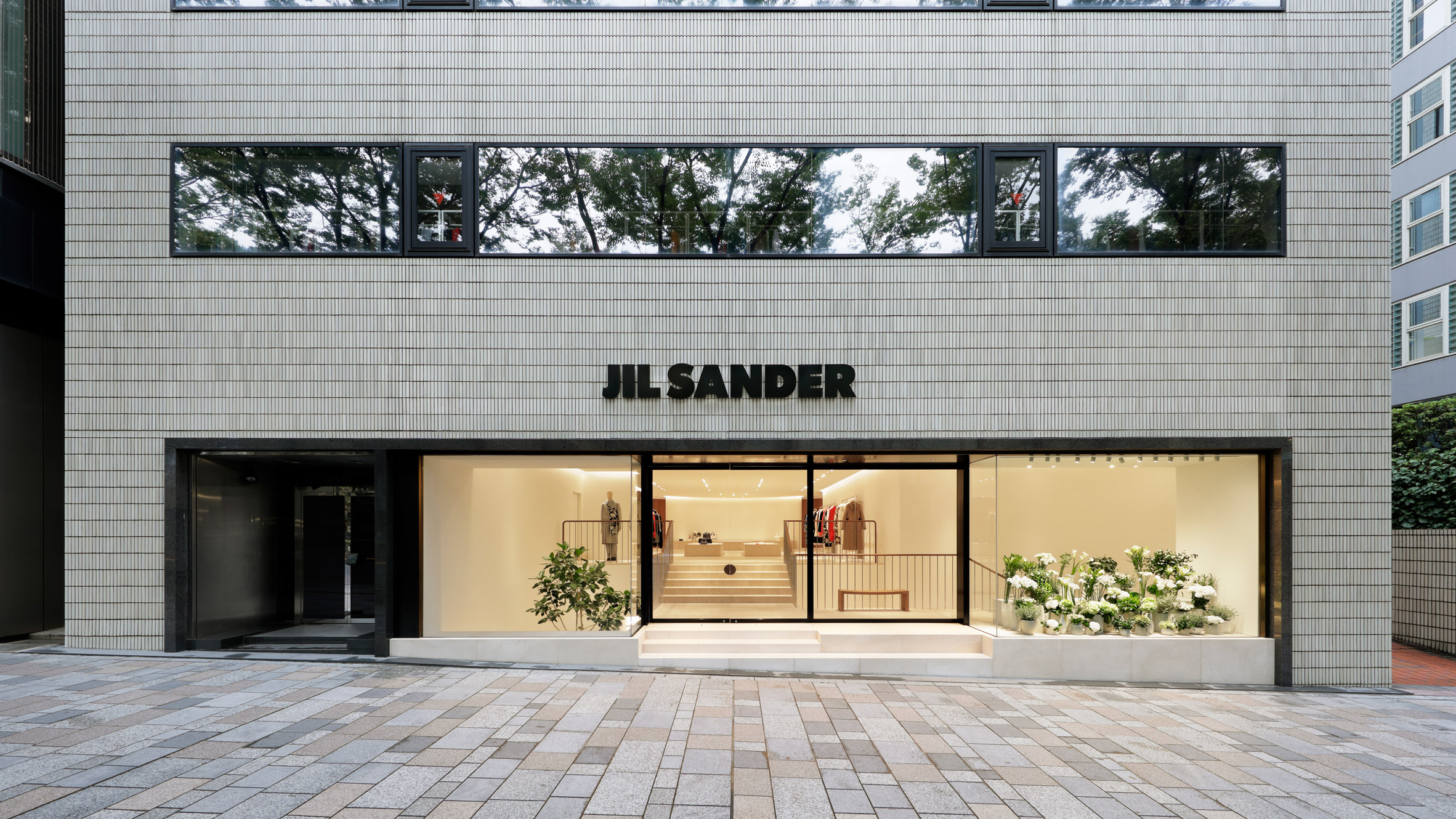
The exterior of the store is clad in slim grey tiles. This is punctured by one long display window that allows passersby an overview of the interior.
A short flight of stairs at street level leads customers up to a display area where clothes are hung on simple, stainless-steel rails.
Blocks of limestone sit in front of a curved partition wall, offering further space for products to be showcased. The same stone also provides the flooring.
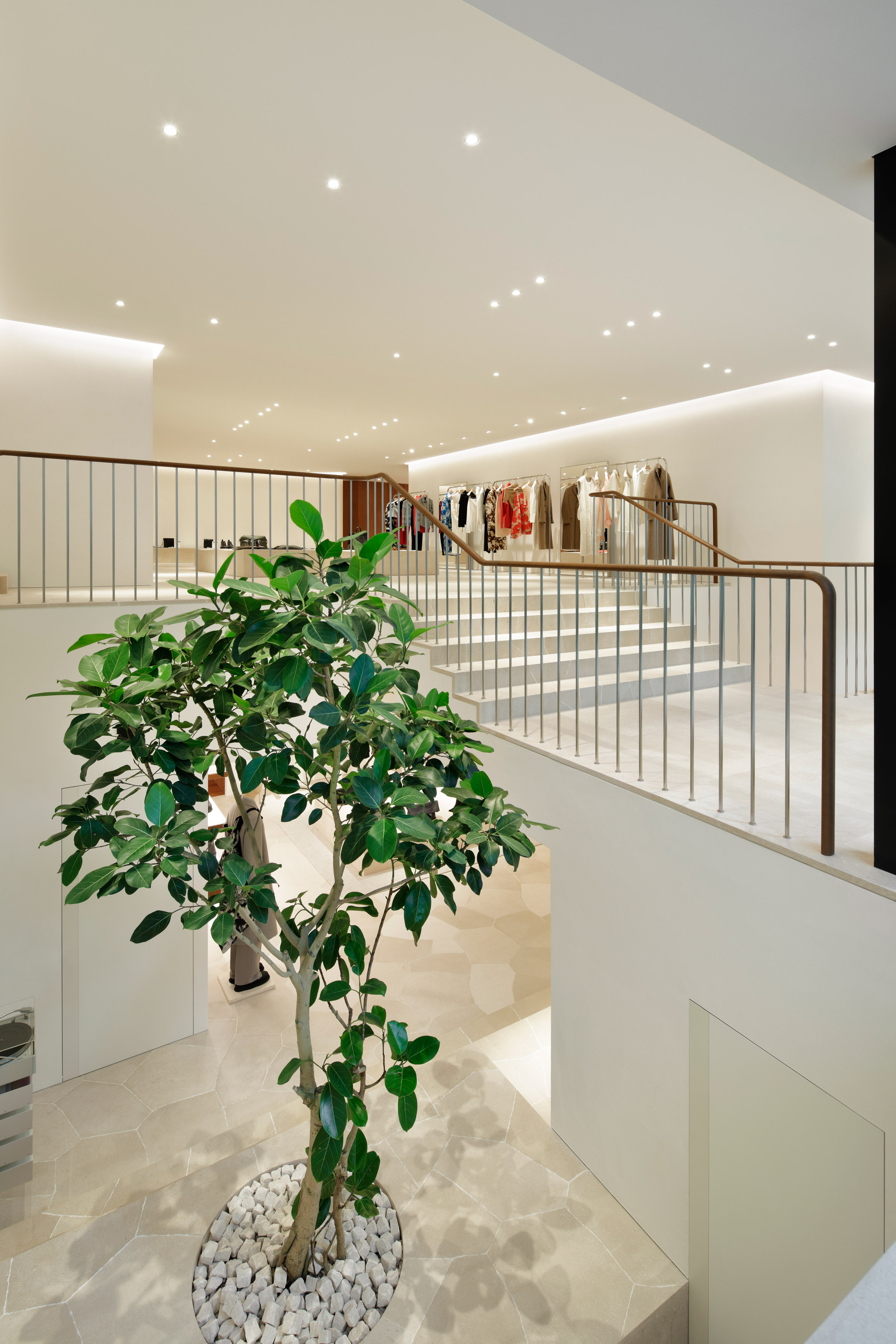
More garments are on show in the basement area, which is finished in much in the same style – although there are a couple of rooms that are lined in panels of warm-hued cherry wood.
The focal point of this level is a tall banyan tree, planted in a corner void, which grows up through the stairwell.

Pawson has created shop interiors for many popular fashion brands. He created a London store for Jigsaw in the 1990s and more recently designed the first physical store for fashion designer Christopher Kane's label.
He believes that, despite the rise of online shopping, there is still a demand for quality retail spaces, as they offer a different experience.
"People can go in and end up coming out with something that they hadn't thought they were looking for," he said.
Pawson's minimalist approach fits in with the recent trend for "instagrammable" interiors – with many architects and designers planning spaces in a way that ensures they will be shared on social media.
But the designer said that, despite being an avid Instagram user himself, he doesn't consider how projects will look in photographs when designing them.
"That's the honest answer," he said. "[The store] is quite photogenic, and the clothes. But I certainly don't design anything to make it easy."
The post John Pawson uses limestone and cherry wood for minimal Jil Sander shop in Tokyo appeared first on Dezeen.


0 Comments:
Post a Comment
Subscribe to Post Comments [Atom]
<< Home