Coloured curtains contrast against white walls at Artek's Helsinki headquarters
SevilPeach has designed the headquarters for Finnish furniture brand Artek, with vivid theatre-style curtains and pale surfaces serving as a backdrop for its collection of minimalist tables and chairs.
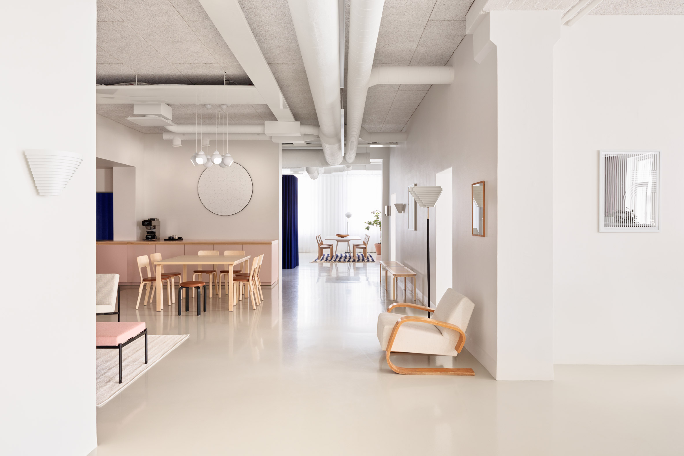
The office occupies the fourth floor of a converted 19th-century apartment building along Mannerheimite, a major street in central Helsinki.
Measuring 470 square metres, the space's internal layout had previously been a rabbit warren of small rooms connected via a long, dark corridor that almost entirely restricted views to the outdoors.
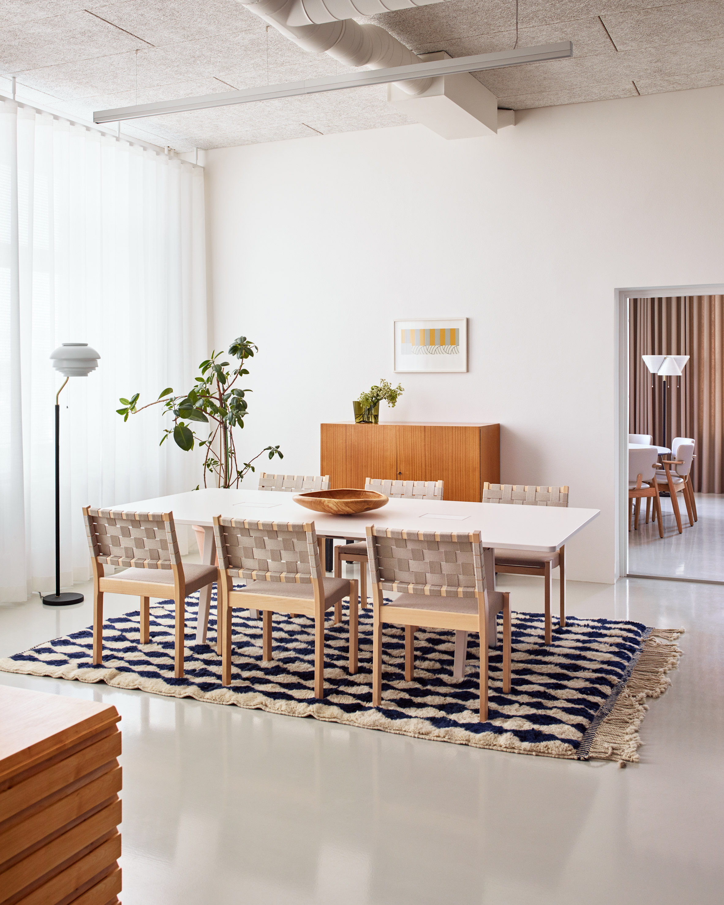
Finnish furniture brand Artek tasked London-based design studio SevilPeach with transforming the site into an airy, light-filled headquarters where it can showcase its own products alongside a host of pieces by Vitra – its parent company.
"SevilPeach has developed many successful work environments for Vitra over the last 20 years, so there was a strong mutual trust which fostered the development of a very special project," Carla Rocneanu, senior architect at SevilPeach, told Dezeen.
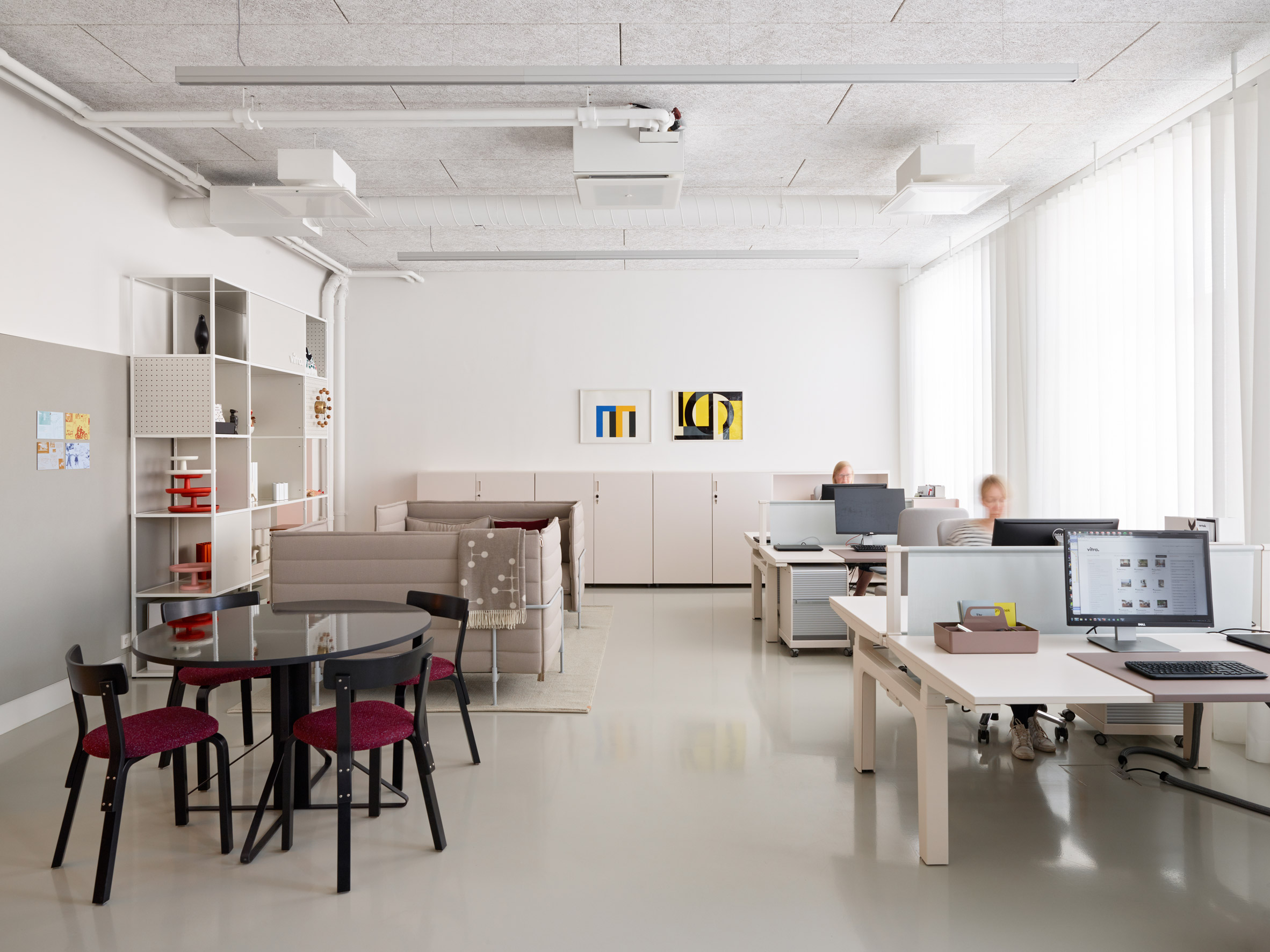
Given just seven months to complete the project, the studio started by removing partition walls to reveal the building's bare structure. A series of openings have also been punctuated in the corridor to link workers to communal areas of the office and allow more daylight to filter through from the peripheral windows.
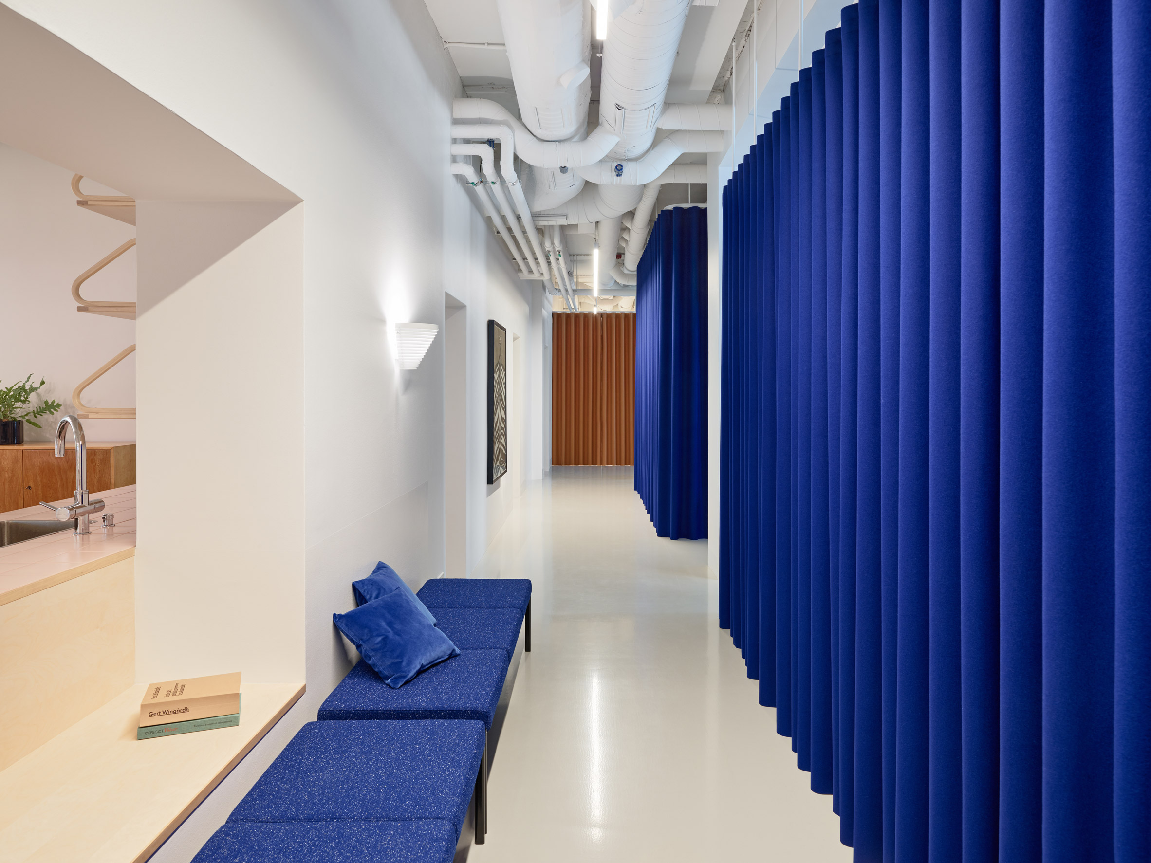
The layout has then been reconfigured to feature just five work rooms and two meeting rooms, all arranged around a break room that has a pale pink kitchen.
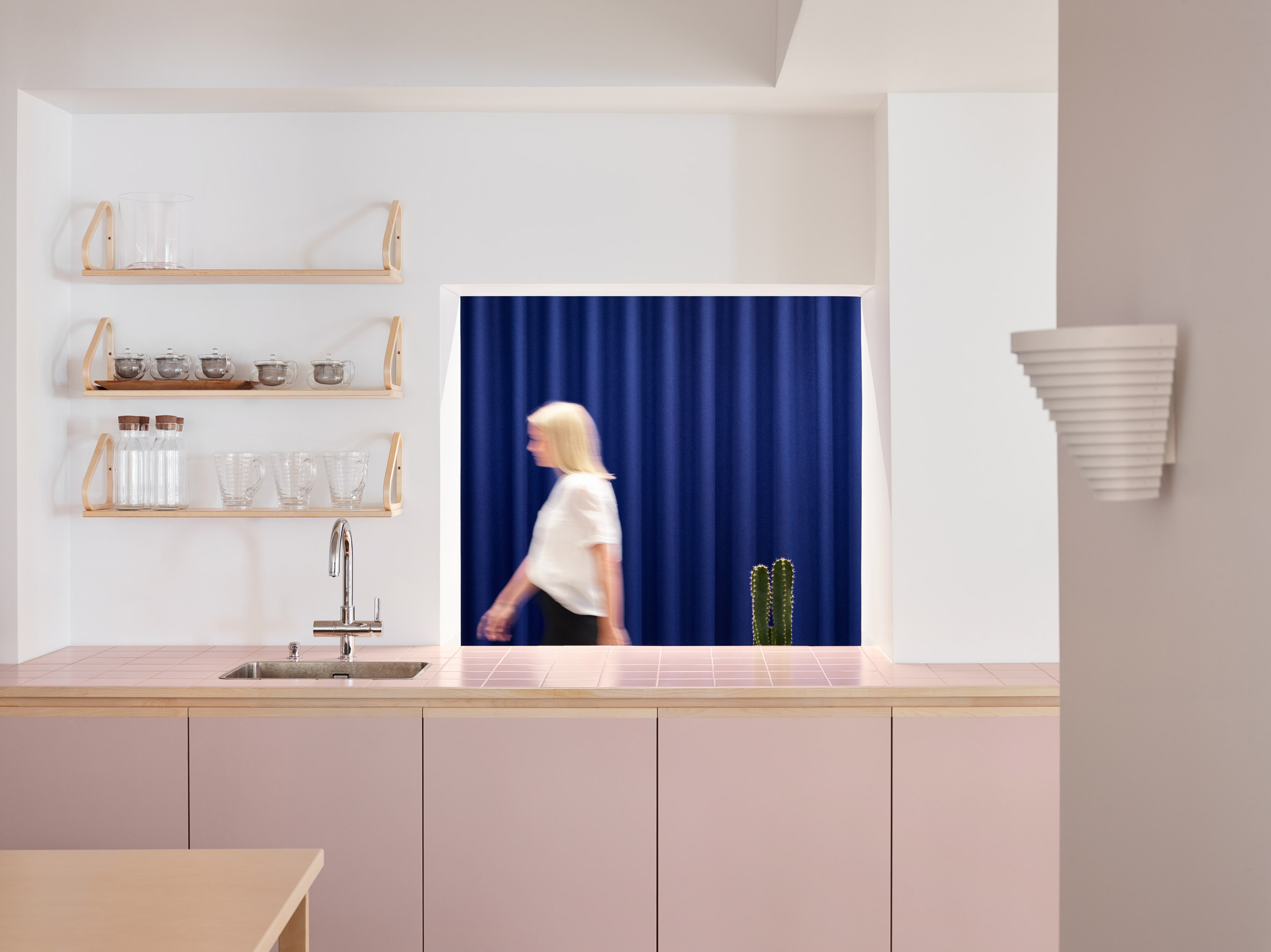
The majority of the walls and ceiling fixtures have been freshened up with a coat of off-white paint, with pops of colour provided by cobalt blue, berry red, and mustard yellow "theatric" curtains.
These curtains have been positioned to conceal busier parts of the office like the material sample library and chair storage unit.
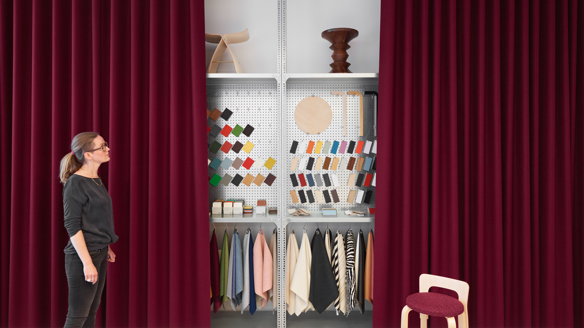
"We took inspiration from Artek's great heritage and it's founder Alvar Aalto's interiors: honest design, functional detailing, natural materials – and every now and then a surprisingly bold splash of colour or pattern," explained Rocneanu.
"For instance, the kitchen tiling refers to the Artke trolleys with their tiled inserts whilst the softly carved birch edge and handle profiles are inspired by Aalto's very tactile use of this nordic material."
Unlike Artek, Studio Job took a maximalist approach for the design of their new headquarters in Antwerp – it features paint-splattered surfaces, neon wall art, and even a spaghetti-print bed.
Photography is by Tuomas Uusheimo.
The post Coloured curtains contrast against white walls at Artek's Helsinki headquarters appeared first on Dezeen.


0 Comments:
Post a Comment
Subscribe to Post Comments [Atom]
<< Home